Scoring genre clarity...
Scoring genre clarity...
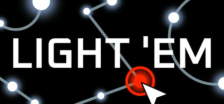
Light 'Em scores 68/100 — better than 18% of Casual capsules (n=10,512).
Positive (16 reviews) · $2.99 · Released Sep 29, 2025 · By Mina Pêcheux
Light 'Em scored 68/100 on Steam Analyzer — Solid for a Casual capsule. Top priority fix: [uniqueness_polish] Introduce a signature visual element—either a distinctive constellation shape, game-specific UI affordance, or artistic flourish—that communicates the core mechanic and creates memorable brand identity
Steam app ID: 3445890 · Tags: Casual, Incremental, Idler, Space, 2D