TRACE Definitive Edition scores 72/100 — better than 46% of Escape Room capsules (n=138).

Quick text summary

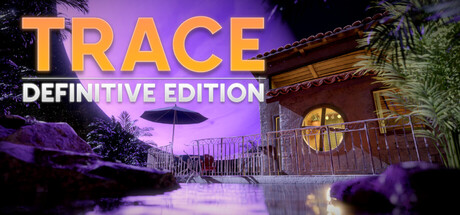
TRACE Definitive Edition scored 72/100 on Steam Analyzer — Good for a Escape Room capsule. Top priority fix: [genre_clarity] Add a subtle puzzle element visual (lock, hieroglyph, or item silhouette) to clarify the escape-room puzzle mechanic over pure exploration mystery.

Capsule scores by dimension

  • Genre Clarity: 7/10 — Mystery adventure clearly signaled. The surreal purple landscape with abandoned architecture, UFO silhouette, and eerie atmosphere effectively communicate a sci-fi mystery adventure game. At tiny size, the purple environment and mysterious setting remain readable, though the specific 'escape game' mechanic is not immediately apparent from visuals alone.
  • Title Readability: 8/10 — Strong title hierarchy, solid legibility. TRACE in large orange-gold lettering dominates the upper portion with high contrast against the purple sky, while 'DEFINITIVE EDITION' sits clearly below in white. The title remains readable even at tiny size due to bold weight and strategic placement on the sky rather than busy foreground, though the tagline becomes harder to parse at extreme reduction.
  • Contrast & Color: 8/10 — Vibrant purple-orange separation stands out. The warm orange-gold title contrasts sharply against the cool purple twilight sky, creating strong visual pop on the dark Steam background. The lit windows and UFO provide additional warm accent points that guide the eye, and the silhouette of the building maintains clear separation even when squinted or viewed at tiny size.
  • Uniqueness & Polish: 7/10 — Atmospheric and polished but familiar trope. The surreal alien landscape with retro architecture and moody lighting shows quality execution and cohesive art direction that feels deliberately crafted. However, the 'mysterious sci-fi world' aesthetic is a common indie adventure trope; while well-rendered, it lacks a distinctive hook or unique visual element that separates it from similar mystery games in the genre.
  • Brand Consistency: 6/10 — Coherent palette, limited iconic identity. The purple-orange color scheme and surreal sci-fi setting appear consistent with the game's visual identity based on the description. However, without clear character or motif recognition, the capsule relies entirely on atmospheric consistency rather than building a memorable brand signature that would be instantly recognizable across promotional materials.
  • Composition: 7/10 — Well-layered with clear focal hierarchy. The composition uses foreground (vegetation, particles), midground (mysterious building with lit windows), and background (purple sky with UFO) to create depth and guide attention upward toward the title. The title placement works well for safe margins, though at full size the composition feels slightly front-loaded with the architectural elements occupying a small portion of the lower half, leaving substantial empty sky that could feel spacious or slightly unbalanced depending on viewing context.

What works

  • High-impact title contrast. Orange-gold 'TRACE' pops powerfully against purple sky and remains clearly readable at all sizes due to bold weight and strategic background placement.
  • Atmospheric sci-fi mood. The surreal alien landscape with eerie lighting, UFO, and mysterious architecture immediately communicates adventure-mystery genre expectations.
  • Strong color harmony. The purple-warm orange palette creates visual cohesion that feels intentional and premium, with accent lighting on the building reinforcing the color story.

What hurts the capsule

  • Generic mystery premise visually. While atmospheric, the mysterious alien world is a familiar indie adventure cliché that doesn't distinguish this game from similar titles like DREDGE or The Invincible at a glance.
  • Tagline legibility collapse. 'DEFINITIVE EDITION' becomes difficult to read at tiny thumbnail size and adds visual clutter without communicating core gameplay appeal.
  • No character or mechanic focus. The capsule emphasizes setting atmosphere over gameplay mechanics or character identity, missing an opportunity to communicate the point-and-click puzzle-solving core loop.

Priority fixes

  1. [genre_clarity] Add a subtle puzzle element visual (lock, hieroglyph, or item silhouette) to clarify the escape-room puzzle mechanic over pure exploration mystery.
  2. [uniqueness_polish] Introduce a distinctive character, artifact, or signature symbol that could serve as recurring brand identity across future promotional materials.
  3. [title_readability] Consider removing or simplifying 'DEFINITIVE EDITION' tagline, or move it to a less prominent position to reduce clutter and improve tiny-size readability.
  4. [composition] Increase the scale or prominence of the building structure to fill dead space and create a more balanced composition across full and small viewing sizes.

Store copy priority fixes

  1. [uniqueness] Replace 'innovative puzzle design' with a concrete example or comparison, e.g., 'Puzzles require you to examine details across multiple rooms simultaneously' or 'The only escape room game where environmental details actively change as you progress.'
  2. [feature_communication] Expand each feature bullet with one specific example: e.g., under 'Unique Puzzles' add 'Connect visual clues hidden across rooms to unlock doors' instead of just 'Make clever connections.'
  3. [hook_strength] Strengthen the short description opening with a more specific emotional hook, e.g., 'Trapped in a cabin on an alien world, you must piece together fragmented clues to escape before the truth catches up with you.'
  4. [audience_targeting] Add a sentence explicitly addressing playtime and intended audience, e.g., 'Perfect for puzzle enthusiasts seeking a 3–5 hour narrative mystery experience' or 'Designed for solo players who love non-violent, brain-teasing adventures.'

Related guides

Steam app ID: 3448760 · Tags: Escape Room, Adventure, Point & Click, Exploration, Puzzle