Scoring genre clarity...

Spear capsule

Spear

A fast-paced action-platformer where a self-aware NPC turns your mouse cursor into a makeshift spear to fight glitches, solve puzzles, and save his own broken game.

$9.99Positive(16)
ExplorationAction3D Platformer
Andrea CavuotoMay 5, 2025

Spear scores 70/100 — better than 33% of Exploration capsules (n=4,872).

Positive (16 reviews) · $9.99 · Released May 5, 2025 · By Andrea Cavuoto

Quick text summary

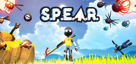
Spear scored 70/100 on Steam Analyzer — Good for a Exploration capsule. Top priority fix: [uniqueness_polish] Add a distinctive visual hook or UI element that hints at the cursor-spear mechanic—such as a stylized cursor icon, digital glitch effects, or broken game visual language that sets this apart from generic platformers

Capsule scores by dimension

  • Genre Clarity: 7/10 — Action platformer with puzzle elements. The capsule communicates action and adventure through the stylized character figure holding a spear-like object, environmental hazards (bombs, mines, projectiles), and dynamic composition with explosions. At tiny size, the yellow character and bright environment read as colorful action content, though the self-aware NPC and cursor-spear mechanic are not visually apparent—these are narrative hooks that the visual alone cannot convey.
  • Title Readability: 8/10 — Bold white title with strong presence. The word 'SPEAR' is rendered in thick white letters with a dark outline, positioned in the upper-center region against a blue sky background with good separation. At small and tiny sizes, the title remains legible due to its large letterforms and high contrast; the outline ensures the text does not dissolve into background noise.
  • Contrast & Color: 8/10 — Vibrant palette with strong value separation. The bright blue sky, vivid yellow grass, and golden/orange explosive elements create clear value separation against the Steam dark background #1b2838. The yellow character figure stands out strongly against both sky and background, and the warm explosion tones read distinctly even at tiny size; the overall palette uses saturation strategically to prevent muddy mid-tones.
  • Uniqueness & Polish: 6/10 — Competent but familiar indie aesthetic. The capsule features clean vector-like character design and colorful, cartoony visual style typical of indie platformers, with no immediately distinctive hook that sets it apart visually from similar games in the genre. While the craft is solid and the composition is intentional, the generic 'action hero against colorful chaos' setup does not clearly communicate the unique selling point of the cursor-spear mechanic or meta-narrative angle that makes this game stand out.
  • Brand Consistency: 6/10 — Consistent but generic indie style. The capsule maintains internal coherence with a unified bright, cartoonish art direction and consistent character design language, but lacks a memorable iconic visual motif or signature palette that would make the game instantly recognizable in future marketing. The style is clean and professional but does not establish a distinctive brand identity beyond 'colorful indie platformer.'
  • Composition: 7/10 — Clear focal point with layered depth. The yellow character in the center-lower area serves as the primary focal point, with environmental hazards (explosions, spikes, projectiles) arranged around the frame to create dynamic energy and a sense of chaos. The composition uses foreground (character), midground (grass and hazards), and background (sky and distant scenery) effectively; however, the scattered placement of hazards risks feeling cluttered at tiny size, and the title placement slightly competes with the upper-center visual weight.

What works

  • Title legibility at all sizes. The thick white 'SPEAR' text with dark outline remains readable from full header down to tiny thumbnail due to strategic letterform weight and background separation.
  • Strong color contrast and value range. Bright yellow, orange, and blue tones pop cleanly against the Steam dark background, maintaining visual clarity and energy even under quick scroll conditions.
  • Coherent visual hierarchy. The character anchors attention while explosions and hazards create radiating interest without overwhelming the focal point.

What hurts the capsule

  • Generic action platformer messaging. The visual does not communicate the unique cursor-spear mechanic or meta-NPC self-awareness angle that differentiates this game from dozens of colorful indie platformers.
  • Lack of memorable brand signature. The capsule relies on familiar indie aesthetic conventions without establishing an iconic visual motif, character quirk, or color signature that would make the game instantly recognizable in future assets.
  • Hazard clutter at small sizes. The scattered bombs, spikes, and projectiles risk creating visual noise when squinting or viewing at tiny size, potentially reducing clarity of the core subject.

Priority fixes

  1. [uniqueness_polish] Add a distinctive visual hook or UI element that hints at the cursor-spear mechanic—such as a stylized cursor icon, digital glitch effects, or broken game visual language that sets this apart from generic platformers
  2. [genre_clarity] Integrate subtle visual storytelling cues (glitch artifacts, broken UI frames, or meta-game elements) to communicate the self-aware NPC narrative and game-within-game concept
  3. [brand_consistency] Develop a signature color accent or iconic visual motif (e.g., a specific glitch color, digital distortion style, or character pose) that can be consistently applied to future store assets for instant brand recognition

Store copy priority fixes

  1. [feature_communication] Expand the 'Bugs Gone Wild' section to explicitly explain the scaling difficulty mechanic: does player power increase bug difficulty automatically? Can it be toggled? Why should players care about this feature?
  2. [feature_communication] Add 1-2 sentences to 'Therapy for broken NPCs' clarifying whether fixing NPC quests is mandatory, optional, or story-critical, and what reward or impact results from doing so.
  3. [feature_communication] Insert a brief line about character customization under a new subsection or integrate it into an existing section to address this tagged feature that currently appears nowhere in the copy.
  4. [audience_targeting] Consider adding a single sentence that explicitly identifies who this game is for: e.g., 'Perfect for players who loved [comp title] and appreciate games that break the fourth wall,' to strengthen audience clarity.

Related guides

Steam app ID: 3453000 · Tags: Exploration, Action, 3D Platformer, Action-Adventure, Character Customization