Scoring genre clarity...
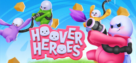
Hoover Heroes is a chaotic, physics-based multiplayer battle game. Compete online with up to 8 friends in various game modes. In this wild competition full of unpredictable moments, laughter will be flying everywhere. May the best Kevin win!
$6.99Positive(13)
Early AccessOnline Co-OpMultiplayer
Kiki GamesNov 20, 2025