Scoring genre clarity...
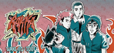
A homage to the gritty fiction of the ’90s. “RAKKA: WAKE 01 - SOOT” unfolds as an episodic, linear visual novel that blends paper-cut style comics, animation, music and dialogue into a slow-burn mystery thriller that dares you to dig deeper — even when you really, really shouldn’t.
$6.99Positive(11)
Visual NovelStory Rich1990's
PMT Games DivisionApr 26, 2026