Scoring genre clarity...
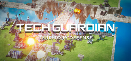
This is a sci-fi strategy game featuring a Defense Mode focused on tower defense and an Attack Mode focused on combat. The game includes over 30 different buildings and units, all of which can be upgraded through entry editing to enhance their performance and firepower.
$7.996 user reviews
StrategyIndieTower Defense
Apex HorizonAug 6, 2025