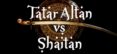
Tatar Altan vs Shaitan scores 73/100 — better than 58% of Action capsules (n=8,534).

Quick text summary

Tatar Altan vs Shaitan scored 73/100 on Steam Analyzer — Good for a Action capsule. Top priority fix: [uniqueness_polish] Introduce the Tatar warrior Altan character or silhouette in the composition to establish iconic protagonist recognition and differentiate from generic action templates.

Capsule scores by dimension

  • Genre Clarity: 8/10 — Clear action slasher positioning. The ornate golden sword and shield iconography immediately signal melee combat and mythological/historical warfare. The versus framing and stylized weapon positioning communicate competitive action gameplay. At tiny size, the sword silhouette and ornamental shield remain distinctly recognizable as action-oriented fantasy combat, though the specific cultural/folklore angle requires reading the title.
  • Title Readability: 7/10 — Readable with minor scale loss. Title text is cleanly rendered in white serif font with strong contrast against the dark background and ornate golden elements. At full and small sizes it reads clearly; at tiny size the letterforms hold but become slightly compressed. The 'vs' separator aids quick parsing, though the ornamental text style adds decorative weight that marginally reduces legibility at smallest scales.
  • Contrast & Color: 8/10 — Strong value separation throughout. White title text pops distinctly against the black background with excellent luminance separation. The warm golden-bronze ornamental sword and shield provide secondary color focal points that lift from the darkness without muddying. In grayscale test, the sword and shield maintain clear silhouettes and the title remains high contrast, supporting discoverability even at tiny thumbnail size.
  • Uniqueness & Polish: 7/10 — Polished mythic presentation. The ornate Islamic/Tatar-influenced shield design and damascus-style sword demonstrate intentional cultural specificity and premium craft that elevates beyond generic fantasy slasher templates. The golden embossed aesthetic and symmetrical composition feel deliberate and cohesive. However, the execution remains within expected mythic action game visual language without a breakthrough distinctive hook that separates it from top-tier action titles like Black Myth: Wukong.
  • Brand Consistency: 6/10 — Competent but limited signature cues. The ornamental shield and sword combination provide a recognizable motif, and the warm gold palette appears consistent with cultural identity. Without access to all 13 screenshots, internal cohesion appears solid with the ornate Islamic geometric patterns and metalwork style forming a coherent visual language. The design suggests a distinctive brand identity around Tatar/Islamic aesthetics, but lacks iconic character or symbol that would be instantly memorable across multiple touchpoints.
  • Composition: 8/10 — Balanced focal hierarchy, safe framing. The sword and shield occupy the center-upper composition with title text layered below, creating clear primary and secondary focal points without clutter. The symmetrical arrangement balances left and right, and the black background provides ample safe margins with no critical elements near cropping edges. At small and tiny sizes the composition remains coherent with the sword and title as dominant anchors and the ornamental circle supporting but not competing.

What works

  • Strong contrast against Steam dark theme. White serif title and gold metalwork create excellent luminance separation that pops on #1b2838 background, maintaining legibility at all viewing scales.
  • Culturally specific visual identity. The ornate Islamic/Tatar geometric patterns and damascus-style weaponry communicate authenticity and differentiate from generic European fantasy action games.
  • Clean composition with clear hierarchy. Centered sword-shield focal point with title below creates natural eye flow; no clutter or awkward negative space; safe margins protect against cropping at all sizes.
  • Readable title at all viewing sizes. White serif font maintains legibility from full header down to tiny thumbnail due to weight and high contrast against dark ground.

What hurts the capsule

  • Ornamental text reduces ultra-small legibility. The decorative serif styling and golden embellishments on the title, while visually premium, cause letterforms to compress and become slightly harder to parse at extreme tiny sizes under quick scroll.
  • Generic mythic action presentation. While culturally specific, the sword-shield-black-background formula closely mirrors many fantasy action titles, lacking a distinctive visual hook that stands apart from HELLDIVERS 2, Black Myth: Wukong, or Lies of P.
  • Limited character or mascot presence. The capsule relies entirely on weaponry and ornament without a visible protagonist, missing the opportunity to establish immediate character recognition like Ghost of Tsushima or Senua's Saga: Hellblade II.
  • No environment or setting context. The black void background and isolated objects provide no visual storytelling about the narrative (earth and underground battles with Shaitan) or gameplay environment, reducing thematic depth.

Priority fixes

  1. [uniqueness_polish] Introduce the Tatar warrior Altan character or silhouette in the composition to establish iconic protagonist recognition and differentiate from generic action templates.
  2. [composition] Add subtle environmental context (underground cavern, mythic battlefield detail) in the background to communicate narrative stakes and visual storytelling beyond isolated objects.
  3. [title_readability] Consider a slightly bolder sans-serif alternative or cleaner serif treatment that maintains the golden ornamental framing but improves character definition at tiny sizes under quick scroll.
  4. [brand_consistency] Ensure the warm gold palette and Islamic geometric patterns appear consistently across all marketing materials and in-game UI to build stronger brand recall across 13 screenshots.

Store copy priority fixes

  1. [feature_communication] Rewrite the opening line: Instead of 'simple action adventure with platformer elements,' specify core verbs: 'Slash through demon-infested lands in this hack-and-slash platformer with roguelike progression, combining melee combat, vertical exploration, and boss battles across hand-crafted levels and an open world.'
  2. [hook_strength] Replace 'epic slasher' with a sensory or conflict-driven hook: 'Descend into an underground demon kingdom to vanquish Shaitan in intense hand-to-hand combat, wielding Tatar warrior traditions and folklore as your guide.'
  3. [uniqueness] Expand the Tatar culture paragraph to explain impact: 'Immerse yourself in Tatar mythology—fight demons from ancient folklore, navigate environments inspired by Tatar legends, and experience combat choreography set to scores by classical Tatar composers, creating a culturally distinct aesthetic you won't find in other action games.'
  4. [feature_communication] Add a bullet-point feature list after the opening paragraph: 'Fast-paced hack-and-slash combat • Platforming challenges and environmental hazards • Roguelike progression with multiple difficulty runs • Open world exploration hub • Boss battles with unique patterns • Atmospheric hand-drawn visuals rooted in Tatar art traditions.'

Related guides

Steam app ID: 3456300 · Tags: Action, Third Person, Hack and Slash, Action Roguelike, Platformer