Scoring genre clarity...

Station Master RPG capsule

Station Master RPG

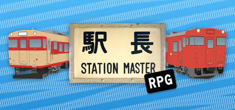
Play the role of the station master at a railway station in rural Japan and cope with the ever-increasing flow of passengers in this RPG management simulation! Use the station's funds to upgrade the station and design it to your liking!

$11.99Mostly Positive(18)
Early AccessSimulationRPG
Telegraph StudiosAug 14, 2025

Station Master RPG scores 75/100 — better than 68% of Early Access capsules (n=3,067).

Mostly Positive (18 reviews) · $11.99 · Released Aug 14, 2025 · By Telegraph Studios

Quick text summary

Station Master RPG scored 75/100 on Steam Analyzer — Good for a Early Access capsule. Top priority fix: [uniqueness_polish] Introduce a distinctive character or mascot (station master figure, quirky NPC) in the foreground to create a memorable brand hook and increase visual distinctiveness against competitor capsules.

Capsule scores by dimension

  • Genre Clarity: 8/10 — Strong management sim identity. The two distinct train cars flanking the central station sign immediately communicate railway/transit management. The Japanese aesthetic, pastoral blue striped background, and 'STATION MASTER' text clearly signal a Japan-themed simulation game. At TINY size, the train silhouettes and station imagery remain readable and genre-appropriate, though 'RPG' label becomes small.
  • Title Readability: 8/10 — Clear, well-placed typography. The cream-colored centered sign with bold black kanji and English text is strategically isolated on a controlled background, ensuring excellent legibility at both FULL and SMALL sizes. At TINY size, the primary 'STATION MASTER' text remains readable, though 'RPG' label becomes compressed but still visible in the clean black box treatment.
  • Contrast & Color: 7/10 — Good separation with warm tones. The orange-red trains and warm cream sign contrast effectively against the cool blue striped background, creating clear silhouettes that read well at scale. The grayscale squint test shows decent value separation, though the mid-tone blue background could compress slightly at tiny sizes; overall the trains and sign maintain distinct edges.
  • Uniqueness & Polish: 7/10 — Charming aesthetic, solid execution. The retro Japanese train aesthetic and nostalgic station sign design feel distinctive for the management sim genre, evoking authenticity and charm. The clean asset rendering, intentional color palette, and cohesive toy-like train models suggest quality craft, though the overall composition remains somewhat straightforward without a bold visual hook that screams 'play this.'
  • Brand Consistency: 7/10 — Consistent rural Japan theme. The capsule establishes a coherent identity with Japanese kanji, retro trains, and pastoral aesthetics that align with a rural station setting. The cream and warm color palette, along with the simplified train model style, creates recognizable visual language, though without an iconic mascot or signature motif that would make it immediately re-identifiable across multiple exposures.
  • Composition: 8/10 — Balanced focal hierarchy. The centered station sign serves as the clear primary focal point, with the two train cars symmetrically flanking it to create pleasing visual balance and depth. The composition reads effectively at SMALL and TINY sizes with no dead space or edge-hugging issues; layering (background stripes, midground trains, foreground sign) guides the eye naturally and creates visual interest without clutter.

What works

  • Strong genre communication. Train imagery, Japanese setting, and 'Station Master' text immediately convey management simulation gameplay with clear visual identity.
  • Readable at multiple scales. Central sign placement on clean background ensures title and core messaging remain legible from FULL down to TINY thumbnail sizes.
  • Cohesive aesthetic polish. Retro toy-like train models, warm color palette, and pastoral blue background create a unified, charming visual style with quality rendering.
  • Effective balance and depth. Symmetric train placement and layered composition (stripes/trains/sign) create visual interest and guide focal hierarchy without clutter.

What hurts the capsule

  • Generic composition formula. Symmetrical arrangement and centered sign, while clear, follow a predictable layout that doesn't feel distinctively premium or memorable against genre competitors.
  • No iconic character or motif. The capsule relies entirely on environmental theme rather than a recognizable mascot, symbol, or signature element that could enable brand recall.
  • RPG label feels secondary. The 'RPG' tag in small black box is subordinate and could be easily missed, leaving slight genre ambiguity at smallest sizes where only management sim aspects dominate.

Priority fixes

  1. [uniqueness_polish] Introduce a distinctive character or mascot (station master figure, quirky NPC) in the foreground to create a memorable brand hook and increase visual distinctiveness against competitor capsules.
  2. [genre_clarity] Strengthen the RPG positioning by adding subtle narrative or character element (e.g., portrait, expression) to reinforce dual management+RPG identity at TINY size.
  3. [composition] Consider asymmetric or dynamic train angle to break predictable symmetry while maintaining clear readability, creating more visual interest and premium feel.

Store copy priority fixes

  1. [hook_strength] Replace 'Play the role of the station master and cope with' with 'Build and expand a rural Japanese railway station while managing' to lead with active, concrete verbs that signal player agency and excitement.
  2. [uniqueness] Add one sentence explaining how city growth responds to station decisions—e.g., 'Your station's success attracts new businesses and housing, transforming the surrounding countryside' to clarify the cause-and-effect loop that differentiates this game.
  3. [genre_clarity] Insert a brief explanation of the current RPG elements in the main description (e.g., 'Develop your station master's skills and unlock new management capabilities') rather than relegating RPG progression entirely to future updates.
  4. [tone_match] Adjust the opening line to feel more warm and inviting to match the cozy aesthetic—shift from 'cope with passengers' to 'delight passengers' or similar language that reflects a more aspirational tone for Early Access audiences.

Related guides

Steam app ID: 3458220 · Tags: Early Access, Simulation, RPG, Trains, Sandbox