Scoring genre clarity...
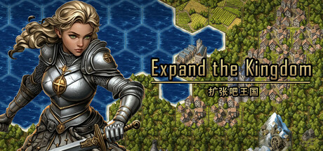
"Expand the Kingdom" is a strategy game based on construction and expansion. In the game, you need to expand and plan land, acquire resources to maintain the internal balance of the kingdom, and survive and defeat all opponents in the competition between kingdoms.
$3.19Mixed(17)
Hex GridStrategyIndie
奥特斯盗Apr 16, 2025