Scoring genre clarity...

AudioRace capsule

AudioRace

Audiorace is an accessible audio game full of adrenaline and smell of burnt tires! Let the sound guide you and race your way to the top.

$6.992 user reviews
RacingSportsArcade
Associazione AudiogamesMar 21, 2025

AudioRace scores 62/100 — better than 2% of Racing capsules (n=762).

2 user reviews · $6.99 · Released Mar 21, 2025 · By Associazione Audiogames

Quick text summary

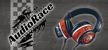
AudioRace scored 62/100 on Steam Analyzer — Solid for a Racing capsule. Top priority fix: [composition] Simplify the background by removing checkered pattern and scratches, replacing with a clean solid or subtle gradient to increase headphone prominence and reading clarity at tiny size

Capsule scores by dimension

  • Genre Clarity: 7/10 — Racing game with audio focus. The motorcycle silhouette in the top left and the racing headphones as the central hero element clearly signal a racing game with audio integration. At tiny size, the headphones remain the dominant focal point and successfully communicate the unique audio-first mechanic, though the checkered pattern background reinforces racing context well.
  • Title Readability: 6/10 — Title readable but tight spacing. The 'AudioRace' title is positioned in the upper left with white outline text that contrasts adequately against the dark textured background. At full size it reads clearly, but at tiny size the text becomes cramped and the decorative scratch effects around it create noise that slightly diminishes legibility despite the outline technique working reasonably well.
  • Contrast & Color: 7/10 — Strong headphone pop, busy background. The red and blue headphones stand out well against the dark gray checkered and textured background, with good silhouette definition in the center-right area. The grayscale squint test shows the headphones maintain clear separation, but the scratchy texture and checkered pattern in the left half create mid-tone clutter that slightly reduces overall pop and clean reading at small sizes.
  • Uniqueness & Polish: 6/10 — Competent but genre-standard execution. The concept of pairing a motorcycle racer with prominent audio headphones effectively communicates the audio-accessibility hook, which is the game's core differentiator. The execution is clean with decent photo-real headphone rendering, but the scratched background treatment and overall composition feel more functional than distinctive; comparable racing games achieve stronger visual storytelling and premium craft.
  • Brand Consistency: 5/10 — No clear identity cues or motifs. The capsule relies entirely on literal headphone imagery and motorcycle silhouette without establishing an iconic symbol, signature palette, or recognizable brand mark that would carry across multiple marketing materials. Without access to the 6 store screenshots, the internal cohesion appears adequate but lacks memorable identity signals—the dark gray, red, and blue are functional but generic to racing and tech brands.
  • Composition: 6/10 — Clear focal point, moderate balance. The headphones anchor the right-center space as the primary hero, while the motorcycle and title occupy the left, creating a balanced two-element layout. At tiny size the composition still reads, but the 50/50 left-right split dilutes hierarchy slightly; the checkered pattern and scratches compete for attention rather than guiding the eye clearly to the audio-first proposition.

What works

  • Clear audio-racing concept. The pairing of headphones with motorcycle silhouette immediately communicates the unique audio-accessibility mechanic that differentiates AudioRace from standard racing games.
  • Strong headphone silhouette. The red and blue headphones have good contrast and clean edges that survive the tiny size test and remain the clear focal point at all viewing scales.

What hurts the capsule

  • Cluttered background texture. The checkered pattern, scratches, and grunge effects create visual noise that competes with the main elements and reduces clarity at small sizes, especially in grayscale.
  • Weak brand identity. No iconic symbol, color signature, or distinctive visual motif establishes a memorable AudioRace brand that would carry across marketing materials or be recognized by repeat customers.
  • Divided focal hierarchy. The 50/50 composition between title/motorcycle on the left and headphones on the right creates equal emphasis rather than a clear single focal point that guides the eye at a glance.

Priority fixes

  1. [composition] Simplify the background by removing checkered pattern and scratches, replacing with a clean solid or subtle gradient to increase headphone prominence and reading clarity at tiny size
  2. [brand_consistency] Develop a distinctive color accent or geometric motif (e.g., sound wave, audio pulse shape) that appears consistently across all marketing materials to build recognition
  3. [title_readability] Increase title font size or weight and reduce decorative scratch effects around 'AudioRace' to ensure legibility at 120x45px without losing the audio-racing concept

Store copy priority fixes

  1. [feature_communication] Explain how audio cues work mechanically: add a sentence like 'Navigate using directional audio cues that adjust in pitch and pan to guide you around bends, with distinct sounds for track obstacles and upcoming turns.'
  2. [hook_strength] Replace generic 'smell of burnt tires' phrasing with a concrete gameplay benefit unique to audio racing, such as 'race purely by ear with spatial audio that replaces visual track markers.'
  3. [feature_communication] Specify the number of available tracks, vehicles, and game modes (e.g., 'Compete in over 10 unique audio tracks with 5 cars and multiple difficulty levels') to ground gameplay scope.

Related guides

Steam app ID: 3461910 · Tags: Racing, Sports, Arcade, Runner, Abstract