Scoring genre clarity...
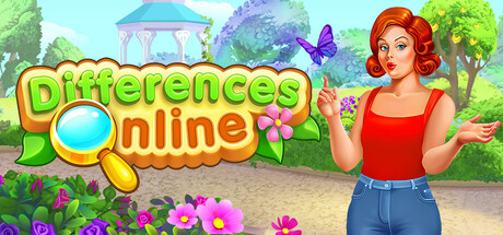
Differences Online - a game of attention and speed! Find the differences between two pictures faster than your opponent in exciting duels. Unlock new levels and locations, improve your attention, and compete for the top spot in the rankings. Play stress-free and enhance your skills.
Free to PlayMixed(89)
CasualHidden ObjectAdventure
Mini ITDec 12, 2025