Scoring genre clarity...

Aerial_Knight's DropShot capsule

Aerial_Knight's DropShot

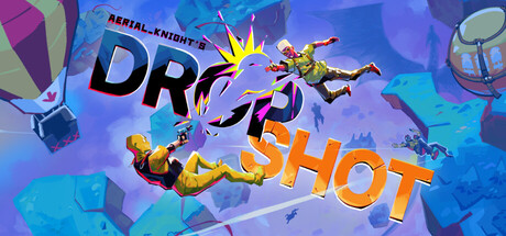
Dropshot is a fast-paced, stylized FPS where you face off against enemies to grab a parachute and land first. Armed with limited "Finger Gun" bullets, outsmart enemies, avoid fire, and use slipstreams to survive. Only one will make it.

$19.99Positive(21)
RacingFPSShoot 'Em Up
Aerial_KnightFeb 17, 2026

Aerial_Knight's DropShot scores 67/100 — better than 12% of Racing capsules (n=762).

Positive (21 reviews) · $19.99 · Released Feb 17, 2026 · By Aerial_Knight

Quick text summary

Aerial_Knight's DropShot scored 67/100 on Steam Analyzer — Solid for a Racing capsule. Top priority fix: [title_readability] Reposition or resize title to sit on a dark controlled background strip or fade overlay, removing competition from geometric shapes behind text.

Capsule scores by dimension

  • Genre Clarity: 7/10 — Action FPS with aerial gameplay cues. The capsule clearly communicates a fast-paced action game through dynamic character poses, airborne positioning, and explosion effects that suggest combat and movement. At TINY size, the airborne silhouettes and combat-ready poses still register as action-oriented, though the specific 'parachute race' mechanic is not immediately obvious without the subtitle. The orange and yellow accents with blue environment suggest sci-fi or stylized action rather than traditional FPS.
  • Title Readability: 6/10 — Title readable full size, struggles tiny. At full header size, 'DROPSHOT' in large orange letters and 'AERIAL_KNIGHT'S' subtitle in blue are legible and have reasonable contrast against the colorful background. However, at TINY thumbnail size (120x45), the title becomes difficult to parse cleanly due to the complexity of background elements competing for attention and the relatively thin letterforms losing clarity. The text placement overlaps busy visual elements rather than sitting on a controlled background region.
  • Contrast & Color: 7/10 — Vibrant palette with solid silhouettes. The bright cyan, purple, orange, and yellow color palette creates strong value separation against the Steam dark background and maintains saturation control that prevents muddiness. Character silhouettes read clearly at full size with good edge definition, and the explosive yellow burst draws immediate attention. At TINY size, the character outlines remain visible but some mid-tone background details blur together, reducing precision in the overall read.
  • Uniqueness & Polish: 7/10 — Stylized and energetic with solid craft. The capsule has a distinctive art direction with a colorful, geometric background aesthetic and dynamic character poses that convey personality and high energy. The visual style feels intentional and premium rather than templated, with multiple layers suggesting depth and movement. However, the core concept—airborne action characters fighting—is not immediately unique within competitive action games, and the 'parachute race' mechanic that makes Dropshot distinct is not clearly telegraphed through the imagery alone.
  • Brand Consistency: 6/10 — Coherent art direction, limited iconography. The capsule maintains consistent rendering with matching character stylization, a unified color palette (cyan, purple, orange), and geometric background design that suggests a cohesive identity. The visual language is clean and organized, but there are no immediately recognizable brand motifs, signature symbols, or iconic character elements that would create lasting brand recall without prior familiarity. The style is distinctive but not anchored by a memorable visual signature comparable to top-tier action game brands.
  • Composition: 7/10 — Clear focal point, balanced depth layers. The composition features a strong primary focal point with two airborne characters positioned in the upper center and middle zones, supported by geometric background shapes and UI elements that guide the eye without competing. Foreground, midground, and background layers create readable depth at full size, and the title placement is integrated into the composition rather than floating randomly. At SMALL size the hierarchy remains intact, but at TINY size the equal visual weight of multiple elements and busy background reduce clarity—the composition could benefit from more dominant foreground subject isolation.

What works

  • Dynamic character poses communicate action. The airborne characters with weapons and explosive energy convey fast-paced gameplay and high energy across all viewing sizes.
  • Vibrant color palette stands out against Steam dark. The cyan, purple, orange, and yellow scheme has strong saturation and value contrast that prevents the capsule from blending into the background.
  • Intentional geometric art direction. The stylized background with clean shapes and layers creates a premium, polished feel distinct from generic asset-based capsules.

What hurts the capsule

  • Title loses legibility at TINY size. The 'DROPSHOT' and subtitle text compete with busy background elements and compress poorly below 120px width, reducing discoverability at thumbnail size.
  • Core mechanic not visually communicated. The parachute racing concept that differentiates Dropshot is absent from the visuals—it reads as generic airborne combat rather than a unique gameplay hook.
  • No iconic brand symbol or character anchor. The composition lacks a memorable visual signature or recognizable character that would create instant brand recall on repeat exposure.

Priority fixes

  1. [title_readability] Reposition or resize title to sit on a dark controlled background strip or fade overlay, removing competition from geometric shapes behind text.
  2. [genre_clarity] Add a visual parachute element or UI hint (like a HUD target or glove icon) to clearly communicate the unique 'parachute grab race' mechanic at TINY size.
  3. [composition] Reduce visual clutter in the background by simplifying geometric shapes or opacity, making the two character figures the dominant focal point that stands out at SMALL and TINY sizes.

Store copy priority fixes

  1. [genre_clarity] Clarify multiplayer type in the short description: specify if rivals are online players, AI bots, or local co-op (e.g., 'Race four AI-controlled rivals in online freefall combat').
  2. [feature_communication] Move or promote the 'Game Modes' section to appear immediately after the short description and before the Features list to emphasize mode variety as a core selling point.
  3. [audience_targeting] Add a sentence early in the detailed description that signals the player type: e.g., 'Perfect for arcade action fans who love high-skill, quick-burst competitive gameplay' to help players self-identify fit.
  4. [hook_strength] In the short description, replace or lead with a more urgent verb-phrase to emphasize the competitive pressure: e.g., 'Freefall combat FPS where you race enemies to the ground—only one survives.'

Related guides

Steam app ID: 3465190 · Tags: Racing, FPS, Shoot 'Em Up, Action, Simulation