Scoring genre clarity...
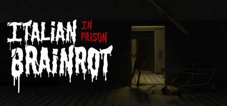
A horror survival game set in a prison corrupted by the madness of the Italian Brainrot movement. Watch the cameras, shut the doors, and save power to survive the monsters. Each night grows more terrifying and unpredictable.
$0.79Very Positive(63)
IndieHorrorSingleplayer
ShLeks, HeroMay 25, 2025