Quick text summary
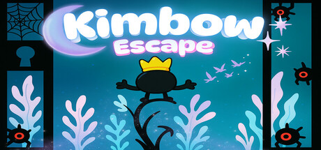
Kimbow Escape scored 72/100 on Steam Analyzer — Good for a Adventure capsule. Top priority fix: [uniqueness_polish] Add a visual cue that signals hardcore difficulty—sharper edges, more menacing trap design, or a more determined character pose—to communicate survival urgency and differentiate from softer indie platformers.
Capsule scores by dimension
- Genre Clarity: 7/10 — Platformer with underwater escape theme. The silhouetted character mid-jump against a teal underwater backdrop with coral and aquatic elements clearly signals action-platformer gameplay. At TINY size, the jumping pose and hazard indicators (mines/spikes on sides) remain readable and reinforce the hardcore platformer expectation. However, the whimsical 'Kimbow' branding and soft art style slightly soften the hardcore danger message described in the game's pitch.
- Title Readability: 8/10 — Bold, readable title with strong placement. The 'Kimbow Escape' logo uses large, rounded white letterforms with a pink/purple gradient fill positioned prominently in the upper center on a controlled dark teal background, avoiding texture clash. At TINY size the text remains legible and the color separation from background is maintained. The tagline 'escape' sits at appropriate secondary weight, though small taglines can blur at extreme thumbnail sizes.
- Contrast & Color: 8/10 — Strong value separation with saturated palette. The capsule leverages high contrast between the bright white/pink title, white coral elements, and dark teal background, creating clear silhouette separation even under grayscale test. The white character, coral plants, and mines pop distinctly against the gradient teal water. At TINY size the core elements maintain edge clarity and the composition reads as cohesive rather than muddy.
- Uniqueness & Polish: 6/10 — Competent but somewhat generic indie style. The aesthetic is polished with clean gradients, symmetrical coral framing, and a cohesive pastel-meets-dark color treatment that feels intentional rather than thrown together. However, the underwater platformer with pastel art direction is a common indie trope; the capsule does not immediately signal what makes Kimbow's mechanics, narrative (king-to-prisoner arc), or challenge level distinctive beyond the visual theme. The design is well-executed but does not clearly communicate hardcore one-hit-death difficulty or time-pressure urgency.
- Brand Consistency: 6/10 — Consistent internal style, limited identity signals. The art direction is internally coherent—soft rounded shapes, a unified teal-to-turquoise gradient palette, and matching illustrated character and environmental assets suggest a single creative hand. However, without reference to the 6 store screenshots, the capsule establishes no iconic character motif, signature symbol, or memorable brand hook beyond the 'Kimbow' name and underwater setting. The style is recognizable as indie-cute but not distinctively Kimbow-specific.
- Composition: 8/10 — Strong focal hierarchy and balanced depth. The jumping silhouetted character forms a clear primary focal point in the center-lower composition, with white coral plants framing left and right edges to create depth layering (background teal, midground coral, foreground character). Title placement at top does not compete with the action. At SMALL and TINY sizes the eye naturally lands on the character and title without scattered attention. Safe margins are respected and the design compresses well across sizes without critical element loss.
What works
- High contrast white elements on teal. Title, character, and coral plants maintain sharp silhouette separation against the background even at tiny size and in grayscale, ensuring discoverability during quick scroll.
- Clear focal point with character pose. The mid-jump silhouette is unmistakably the primary subject and immediately communicates action-platformer gameplay without ambiguity.
- Balanced composition with framing corals. Left and right coral elements guide the eye and create depth layering while protecting title and character from edge-clipping concerns.
What hurts the capsule
- Generic whimsical indie aesthetic. Pastel underwater platformer theme is common in indie market and the capsule does not clearly differentiate Kimbow's unique selling point or hardcore difficulty from competitors.
- Soft branding signals. The cute rounded style and gentle palette contradict the game's pitch of brutal one-touch-death platforming and 'king to prisoner' narrative weight, missing opportunity to communicate stakes.
- Limited iconic character recognition. The protagonist reads as a generic silhouetted figure with a crown; there is no distinctive pose, accessory detail, or personality cue that would make the character memorable or instantly Kimbow-specific.
Priority fixes
- [uniqueness_polish] Add a visual cue that signals hardcore difficulty—sharper edges, more menacing trap design, or a more determined character pose—to communicate survival urgency and differentiate from softer indie platformers.
- [genre_clarity] Emphasize the time-pressure mechanic by incorporating visible hourglass imagery or a countdown element in the composition to reinforce the 'every second defines survival' core mechanic at small size.
- [brand_consistency] Introduce a signature character detail, expression, or pose unique to Kimbow that could anchor brand recognition across future marketing materials and store page visuals.
Store copy priority fixes
- [feature_communication] Clarify the hourglass mechanic in the short description: specify whether failure to find the next hourglass means instant game-over, level restart, or progression lock, and explain how this creates tension distinct from standard time attacks.
- [hook_strength] Lead the detailed description with the hourglass loop mechanic before narrative exposition: 'You have 5 minutes to find the next magical hourglass or face [specific consequence]. Navigate deadly traps and enemies in this hardcore platformer where every second matters.'
- [uniqueness] Replace generic phrases ('epic battles,' 'reclaim your glory') with game-specific language that emphasizes the invulnerability mechanic and its strategic use against one-hit-kill traps—this is the key differentiator.
- [feature_communication] Expand the '10 Soundtracks' bullet into something gameplay-relevant: explain how music or audio design reacts to player state or increases pressure as the 5-minute timer depletes.
Related guides
Steam app ID: 3470070 · Tags: Adventure, Indie, Action, Platformer, 2D