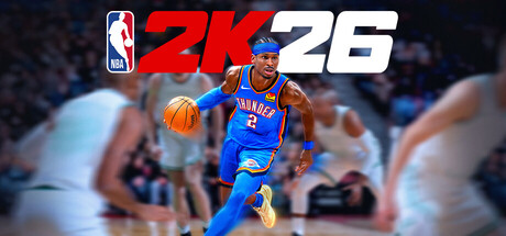
NBA 2K26 scores 88/100 — better than 99% of Sports capsules (n=992).

Quick text summary

NBA 2K26 scored 88/100 on Steam Analyzer — Excellent for a Sports capsule. Top priority fix: [uniqueness_polish] Consider adding subtle visual elements (team logo glow, UI mode icons, or year-specific visual effect) to differentiate 2K26 from prior capsule iterations and emphasize franchise evolution.

Capsule scores by dimension

  • Genre Clarity: 9/10 — Basketball sport instantly recognizable. The NBA logo in top left, professional player in full uniform dribbling a basketball against a stadium crowd background, and bright arena lighting all communicate basketball sport with absolute clarity. At tiny size, the NBA shield logo and ball remain unmistakable genre signals that survive extreme reduction.
  • Title Readability: 9/10 — Bold logo reads perfectly at all sizes. The 2K26 title uses high-contrast red and white letterforms with thick strokes positioned prominently in the upper third, paired with the official NBA logo shield. At tiny size this remains legible and recognizable due to strong value separation and heavy weight; the typography does not collapse under reduction.
  • Contrast & Color: 9/10 — Strong light-dark separation and saturation. The player's bright blue Oklahoma City Thunder uniform, warm golden basketball, and red title text all pop sharply against the cool blue and blurred stadium background on the dark Steam background. Grayscale test confirms clear silhouette separation with the player in light tones and crowd in mid-dark tones, creating depth and preventing blend.
  • Uniqueness & Polish: 8/10 — Professional render with branded flair. The capsule leverages authentic NBA branding (official shield logo, real team uniform), ProPLAY hyper-realistic player model, and dynamic action pose that communicates the game's core mechanic of player control and athleticism. The execution feels polished and premium without generic asset vibe, though the hero shot formula is expected within the 2K sports franchise tradition.
  • Brand Consistency: 9/10 — Iconic NBA 2K brand identity signals. The design reinforces the NBA 2K franchise through consistent use of the official NBA shield, bold red and white color scheme matching series tradition, and the signature hero player shot against crowd background. These elements form a recognizable visual identity that aligns with NBA 2K24 and 2K25 capsule language while maintaining year-specific numbering.
  • Composition: 9/10 — Clear focal point with strong hierarchy. The player occupies the center-right of the frame as the primary focal point, with the NBA logo and 2K26 title anchoring the upper left in a logical reading order, and the blurred crowd background providing depth without competing for attention. The composition survives cropping at small and tiny sizes with the player and title both remaining prominent; safe margins protect key elements from edge cutoff.

What works

  • NBA official branding clarity. The licensed NBA logo shield and authentic team uniform instantly establish credibility and genre specificity that resonate with the target sports game audience.
  • Dynamic action pose communicates gameplay. The player's active dribbling stance and athletic expression convey player control and skill expression rather than a static portrait, teasing MyCAREER and competitive mechanics.
  • Excellent legibility at reduction. Both the 2K26 title and NBA logo maintain clarity at tiny thumbnail size due to bold letterforms, thick strokes, and high contrast against background.
  • Layered depth with crowd context. The blurred stadium crowd in the background establishes arena atmosphere and competitive stakes while keeping visual focus on the center player without creating clutter.

What hurts the capsule

  • Limited color novelty within series. The red, white, and blue palette is expected for NBA 2K but offers minimal visual differentiation from previous 2024 and 2025 capsules in the franchise.
  • Generic sports hero shot formula. While executed well, the isolated player against crowd setup follows standard sports game capsule convention and does not communicate franchise-specific features like MyTEAM, MyNBA, or The W modes.

Priority fixes

  1. [uniqueness_polish] Consider adding subtle visual elements (team logo glow, UI mode icons, or year-specific visual effect) to differentiate 2K26 from prior capsule iterations and emphasize franchise evolution.
  2. [composition] Evaluate whether introducing a secondary design accent (such as a controller input hint or game mode badge) in the lower corner could reinforce the 'competitive modes' messaging without cluttering the focal point.

Store copy priority fixes

  1. [feature_communication] Add a 1-2 sentence explanation of ProPLAY that describes what it changes in practice—e.g., 'Feel responsive dribble mechanics and footwork timing pulled directly from real NBA movement data' rather than vague 'immersive technology.'
  2. [uniqueness] Insert a comparison or 'new in 2K26' section that highlights what distinguishes this year's version—e.g., new MyCAREER storylines, updated rosters, or new City features—to justify the purchase.
  3. [hook_strength] Rewrite the opening to lead with a dominant action verb—e.g., 'Build your NBA superstar, collect dream teams, or manage a franchise in NBA 2K26' before pivoting to competitive mode messaging.
  4. [feature_communication] Clarify the role of virtual currency and card progression in core modes, since VC is heavily bundled but barely explained in gameplay terms.

Related guides

Steam app ID: 3472040 · Tags: Sports, Basketball, Simulation, Multiplayer, 3D