Scoring genre clarity...
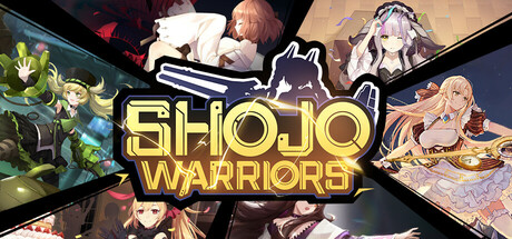
Shojo Warriors is a fast-paced multiplayer brawl game set in a vibrant, anime-inspired fantasy world, made with『CliCli』. In this game, you'll purchase and combine equipment during battles to help the girls achieve victory through growth and strategic gameplay.
Free to Play6 user reviews
ActionRPGMOBA
Bit VitaminFeb 27, 2025