Quick text summary
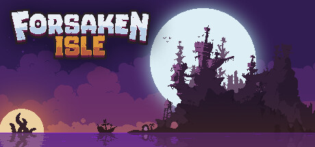
Forsaken Isle scored 73/100 on Steam Analyzer — Good for a Adventure capsule. Top priority fix: [genre_clarity] Add subtle combat or action iconography (weapon silhouette, fire, or dynamic pose) to the foreground to reinforce the action gameplay pillar without cluttering the composition.
Capsule scores by dimension
- Genre Clarity: 7/10 — Island survival theme clear. The silhouetted castle/structure, moon backdrop, and desert island setting clearly signal survival or adventure gameplay. At TINY size, the iconic moon and dark fortress silhouette remain readable and evoke a mysterious island locale. However, the action and combat aspects are not visually prominent—it reads more as exploration or story-driven adventure than action-focused gameplay.
- Title Readability: 8/10 — Strong title with solid contrast. FORSAKEN ISLE displays white text with strong outline and drop shadow against the purple sky, maintaining legibility at all sizes. The two-line layout with bold blocky typography is well-spaced and reads clearly even at TINY size, though the yellow ISLE subtitle adds visual interest without sacrificing clarity. The title does not collapse when squinted and remains the dominant focal point across all viewing sizes.
- Contrast & Color: 8/10 — High value separation and pop. The bright white and yellow title text pops strongly against the deep purple and dark blue background (#1b2838 simulation). The pale moon provides excellent contrast in the upper right, and the silhouetted castle creates clear dark-light separation. In grayscale, the light moon and bright title text separate cleanly from mid-tone sky and dark foreground elements, maintaining strong readability at SMALL and TINY sizes.
- Uniqueness & Polish: 7/10 — Distinctive mood, competent execution. The moody nocturnal island aesthetic with moon and silhouetted castle feels atmospheric and more premium than generic survival fare. The pixel-art style typography and cohesive purple-orange-blue gradient palette create visual personality. However, the silhouette approach, while effective, is not visually unique—moonlit castle scenes are common in indie game marketing, and the overall composition lacks a clear gameplay differentiator or iconic hook beyond mood.
- Brand Consistency: 6/10 — Cohesive but not memorable. The purple-orange-blue color scheme and pixel-art title treatment are internally consistent and well-executed. The moon and castle motif are thematically locked to the island survival concept. However, there are no distinctive character, symbol, or visual signatures visible that would make Forsaken Isle immediately recognizable in future marketing—the identity is competent and thematic but generic within the survival genre.
- Composition: 8/10 — Balanced hierarchy with clear focal point. The title dominates the upper half with the moon and castle silhouette anchoring the right side and lower third, creating natural visual flow. The layered depth—bright moon, dark castle, gradient sky, and lower foreground elements—provides visual staging. At SMALL and TINY sizes, the title and moon remain the clear primary subjects, and the balanced left-right composition avoids dead zones; however, the castle silhouette edges approach the right margin and could face slight cropping risk on narrow displays.
What works
- Title legibility across all sizes. FORSAKEN ISLE maintains sharp contrast and readability from full size down to TINY thumbnail thanks to bold outline, drop shadow, and white-on-purple color strategy.
- Atmospheric mood and cohesion. The nocturnal island setting with gradient sky, moon, and castle silhouette creates a unified premium-feeling aesthetic that matches the survival theme.
- Strong value contrast against dark background. Bright moon and title pop distinctly against deep purple and blue tones, ensuring the capsule stands out in Steam store browsing without relying on saturated colors.
What hurts the capsule
- Generic survival aesthetic. Moonlit castle scenes are common indie marketing tropes, and the silhouette approach lacks distinctive visual character or gameplay hint that sets Forsaken Isle apart from peers.
- Castle edges too close to margin. The dark fortress silhouette on the right side approaches the frame edge and may face slight clipping on certain Steam display widths, risking visual balance.
- Action elements not visually prominent. The capsule reads as exploration or story-driven adventure rather than action or combat-focused, which may not match player expectations for an action survival game.
Priority fixes
- [genre_clarity] Add subtle combat or action iconography (weapon silhouette, fire, or dynamic pose) to the foreground to reinforce the action gameplay pillar without cluttering the composition.
- [composition] Inset the castle silhouette 20-30 pixels from the right edge to ensure safe margin clearance across all Steam display widths and prevent edge clipping.
- [uniqueness_polish] Introduce a distinctive visual hook such as a unique island landmark, player character silhouette, or branded element that differentiates Forsaken Isle from generic survival moonlit scenes.
Store copy priority fixes
- [uniqueness] Add a sentence explaining what makes Forsaken Isle's world, building system, or progression distinct from other survival sandboxes (e.g., 'Combine relaxation with purposeful exploration' or 'Only survival game with X mechanic').
- [hook_strength] Rewrite the short description to lead with an emotional or gameplay hook: replace 'action survival game' with something like 'Survive and thrive on a mysterious island where you build, explore, and uncover secrets at your own pace'.
- [audience_targeting] Explicitly mention 'perfect for casual players' or 'no permadeath/stress' early in the detailed description to reinforce the relaxation angle and set expectations for difficulty.
Related guides
Steam app ID: 347940 · Tags: Adventure, Survival, Pixel Graphics, Crafting, Action