Scoring genre clarity...

Shadow of The Forgotten capsule

Shadow of The Forgotten

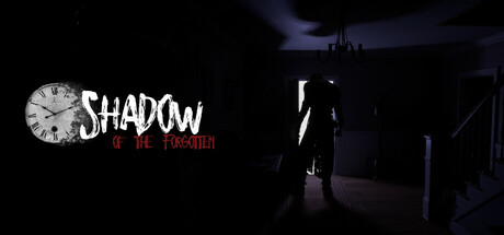
In a long-abandoned mansion of Dr. Victor Grimm, players find themselves trapped after a sudden collapse of the mansion's entrance. As they explore the sprawling, decaying building, they uncover secrets, and disturbing relics of Dr. Grimm's experiments.

$9.992 user reviews
CasualPuzzle3D
Shades of PlayMar 14, 2025

Shadow of The Forgotten scores 72/100 — better than 43% of Casual capsules (n=10,153).

2 user reviews · $9.99 · Released Mar 14, 2025 · By Shades of Play

Quick text summary

Shadow of The Forgotten scored 72/100 on Steam Analyzer — Good for a Casual capsule. Top priority fix: [composition] Introduce a secondary visual element or depth layer on the right side of the frame (e.g., experimental relics, architectural detail, or glowing anomaly) to balance composition and reinforce the 'trapped in mansion with dark secrets' premise.

Capsule scores by dimension

  • Genre Clarity: 7/10 — Dark mystery adventure readable. The silhouette of a solitary figure in a shadowed mansion interior, combined with the gothic clock motif and decaying architecture, clearly communicates a psychological horror or dark adventure game. At tiny size, the figure and eerie setting remain recognizable, though the specific 'mansion mystery' subgenre requires the full header to fully land the trapped exploration premise.
  • Title Readability: 8/10 — Strong contrast, holds at small. The 'SHADOW' text in bold white with a decorative clock icon anchors the left side against the dark background, and the red 'OF THE FORGOTTEN' subtitle adds color separation below. The title remains legible at small size due to high contrast and generous spacing, though the tagline text becomes soft at tiny size but does not collapse the primary brand.
  • Contrast & Color: 8/10 — High value separation, clean silhouettes. White and red text pop sharply against the near-black background (#1b2838 simulation), and the central figure is backlit with pale blue tones that create clear silhouette separation from the dark mansion interior. The color palette is restrained and cohesive, avoiding muddy mid tones; at tiny size, the light figure and red accent remain distinct.
  • Uniqueness & Polish: 7/10 — Thematic cohesion, vintage clock hook. The clock logo is a memorable visual hook that signals time-pressure or decay thematically, and the composition feels intentional rather than template-like. The craftsmanship is solid—the figure pose and architectural framing suggest professional art direction—though the silhouette approach is somewhat familiar in indie horror and does not push beyond established conventions.
  • Brand Consistency: 6/10 — Cohesive but limited memorable identity. The clock motif, dark palette, and silhouette figure are internally consistent and reinforce a Victorian-gothic aesthetic that aligns with the mansion premise. However, without reference to the five store screenshots, the visual identity feels more genre-standard than distinctly iconic; the clock is the strongest brand anchor but lacks a signature character or color that would ensure instant recognition.
  • Composition: 7/10 — Clear focal point, safe margins. The figure is centered as the primary focal point, with the clock logo anchoring the upper left and the title distributed along the left edge, creating a left-aligned hierarchy that avoids center clutter. The composition is resilient at small and tiny sizes; however, the right side of the frame feels underutilized and slightly empty, and the figure's position near the vertical centerline could benefit from more deliberate depth layering to separate foreground from the mansion backdrop.

What works

  • Logo-title integration. The clock icon seamlessly merges with the 'SHADOW' wordmark, creating a unified visual anchor that reinforces both brand identity and thematic relevance without feeling forced.
  • Dark palette restraint. The near-total black background with selective white and red accents maximizes legibility and impact against Steam's dark UI, making the capsule command attention in quick scroll.
  • Silhouette readability at scale. The backlit figure remains recognizable and distinct even at tiny thumbnail size, maintaining the eerie mood across all viewing conditions.

What hurts the capsule

  • Right-side compositional void. The right half of the frame is largely empty mansion background, creating imbalance and wasting prime real estate that could strengthen visual hierarchy or introduce supporting visual storytelling.
  • Limited brand distinctiveness. While thematically cohesive, the capsule relies on familiar gothic horror visual language (abandoned mansion, lone figure, decay) without a standout character, symbol, or color signature that would differentiate it from similar indie horror titles.
  • Subtitle legibility collapse at tiny. The red 'OF THE FORGOTTEN' tagline becomes difficult to parse at true thumbnail size, reducing the full title clarity to just 'SHADOW' at the smallest view.

Priority fixes

  1. [composition] Introduce a secondary visual element or depth layer on the right side of the frame (e.g., experimental relics, architectural detail, or glowing anomaly) to balance composition and reinforce the 'trapped in mansion with dark secrets' premise.
  2. [brand_consistency] Develop or elevate a signature motif beyond the clock—such as a recurring symbol, color accent, or character silhouette—that could anchor brand recognition across store pages and social media.
  3. [title_readability] Increase the size or weight of the 'OF THE FORGOTTEN' subtitle or reposition it to ensure legibility at tiny thumbnail size without sacrificing overall balance.

Store copy priority fixes

  1. [feature_communication] Replace lore exposition with a concrete gameplay description: e.g., 'Solve environmental puzzles and collect clues to uncover the truth about Dr. Grimm's experiments while uncovering the mansion's dark history.' Specify what a player does minute-to-minute.
  2. [hook_strength] Rewrite the short description to open with an active hook: 'Trapped in Dr. Grimm's cursed mansion, you must solve deadly puzzles and uncover dark secrets to escape—if the house itself lets you.' This creates urgency and curiosity.
  3. [uniqueness] Clarify the time trap mechanic in the detailed description with a concrete example: 'Witness echoes of the past and manipulate time-locked puzzles to unlock the mansion's secrets.' Without explanation, it reads as generic.
  4. [audience_targeting] Resolve the casual vs. horror tension by specifying difficulty and tone in the short description: either emphasize 'approachable puzzle-solving' for casual players or 'genuinely unsettling horror' for horror enthusiasts, not both.

Related guides

Steam app ID: 3484450 · Tags: Casual, Puzzle, 3D, First-Person, 1990's