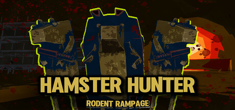
Hamster Hunter: Rodent Rampage scores 68/100 — better than 17% of Action capsules (n=8,534).

Quick text summary

Hamster Hunter: Rodent Rampage scored 68/100 on Steam Analyzer — Solid for a Action capsule. Top priority fix: [genre_clarity] Integrate a visually distinct hamster-men character element or mutant feature into the suit design or foreground to communicate the unique premise at small sizes

Capsule scores by dimension

  • Genre Clarity: 7/10 — Action shooter theme clear. The oversized mech-like suits with glowing accents and weaponized silhouettes immediately signal action gameplay. The yellow neon outline aesthetic reinforces a sci-fi shooter identity. At tiny size, the geometric suit shapes and orange fire effect still read as combat-focused, though the hamster-specific premise is lost without text.
  • Title Readability: 8/10 — Bold yellow type stands out. HAMSTER HUNTER in large yellow all-caps is highly legible against the dark background and doesn't collapse at small sizes. The secondary tagline RODENT RAMPAGE remains readable at small size thanks to consistent weight and placement below the primary title. Yellow-on-dark provides strong value separation that holds through the tiny thumbnail.
  • Contrast & Color: 8/10 — High value separation works. Yellow title and neon suit outlines create strong contrast against the #1b2838 dark background. The orange fire glow at center-right adds warm accent that pulls the eye. At tiny size, the silhouettes remain distinct from background due to the neon framing, though the dark suit interiors can muddy slightly when squinting.
  • Uniqueness & Polish: 6/10 — Competent but generic sci-fi. The armored mech aesthetic is well-rendered with clean neon outlines and lighting effects, but visually resembles standard military sci-fi shooter tropes seen in HELLDIVERS 2 and Warhammer 40K. The hamster premise is the unique hook, but it's completely lost at small sizes—viewers cannot tell this is about killer rodents from visuals alone. The craft is solid but the execution defaults to familiar heavy armor iconography.
  • Brand Consistency: 5/10 — Generic mech suits lack identity. The oversized armored suits dominate but have no distinctive character silhouettes or signature visual motif that distinguishes Hamster Hunter from dozens of other sci-fi shooters. The neon yellow outline style is applied uniformly without memorable logo usage, mascot, or thematic symbol that would create lasting brand recognition. Without the text, this could be any military action game.
  • Composition: 7/10 — Balanced symmetry with clear focal. The three armored figures create a strong symmetrical composition with the orange fire explosion at center-right as the focal point, drawing the eye naturally. Title placement below respects safe margins and doesn't interfere with the primary visual. The layering of suits front-to-back gives depth, but at tiny size the individual elements compress together and lose spatial separation.

What works

  • Strong title contrast and legibility. Yellow all-caps text reads clearly at all sizes and provides excellent value separation against the dark background without loss of readability at tiny thumbnail scale.
  • Professional neon aesthetic cohesion. The consistent yellow neon outline treatment across all three suit silhouettes and the structured composition create a unified, polished visual identity.
  • Clear action genre signaling. Oversized armored figures, weaponized poses, and orange fire effects immediately communicate this is a combat-focused shooter without ambiguity.

What hurts the capsule

  • Loses unique premise at small size. The hamster-men concept—the core differentiator—is completely invisible without readable text, making the capsule indistinguishable from generic sci-fi military shooters at thumbnail scale.
  • Generic mech silhouettes lack personality. The armored suits are visually identical to dozens of other shooter franchises with no distinctive character design, mascot appearance, or visual hook that communicates brand identity.
  • Midtone compression at tiny sizes. When squinting or viewing at small scale, the dark interior details of the suits blend into the background, reducing silhouette clarity and visual pop.

Priority fixes

  1. [genre_clarity] Integrate a visually distinct hamster-men character element or mutant feature into the suit design or foreground to communicate the unique premise at small sizes
  2. [brand_consistency] Replace one generic suit with a distinctive armored hamster character with recognizable facial features or a signature color accent that becomes the mascot identity
  3. [uniqueness_polish] Add a memorable logo or icon (e.g., a hamster paw symbol, lab insignia) that appears consistently and creates brand recognition independent of text

Store copy priority fixes

  1. [hook_strength] Revise the short description to replace 'bullet hell shooter' with 'boomer shooter' to eliminate genre confusion and set correct player expectations immediately.
  2. [uniqueness] Add a sentence to the detailed description highlighting one specific gameplay or level design element that distinguishes this from other boomer shooters (e.g., 'Navigate dynamic lab environments where destructible terrain changes your approach to combat' or 'Weapon synergy systems reward creative loadout combinations').
  3. [audience_targeting] Replace 'Do you have what it takes?' with audience-specific language that signals the intended player: e.g., 'Perfect for speedrunners chasing S-rank times and score-chasers pushing for new highs' to clarify the core appeal.

Related guides

Steam app ID: 3486050 · Tags: Action, Boomer Shooter, First-Person, Gore, Shooter