Scoring genre clarity...
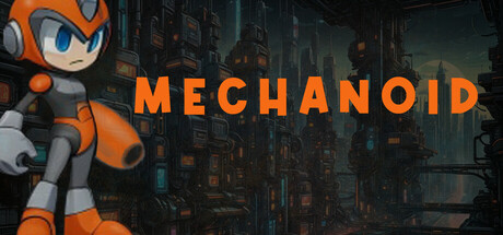
In a world where machines have claimed dominion over Earth, survival means never standing still. Mechanoid throws players into a relentless battle against robotic forces across diverse and treacherous terrain where mechanical monstrosities lurk behind every corner.
$14.99No user reviews
2D PlatformerPlatformerArcade
Snake Valley StudiosJul 16, 2025