Scoring genre clarity...

The Dunkers capsule

The Dunkers

Great 1on1 fun! Homage to 2D basketball and keyboards! Dunks, shoots, layups and blocks you will feel! Dunk you very much!

$9.99Positive(13)
SimulationSide Scroller2D
UO 5 rusaJan 6, 2026

The Dunkers scores 77/100 — better than 71% of Simulation capsules (n=5,188).

Positive (13 reviews) · $9.99 · Released Jan 6, 2026 · By UO 5 rusa

Quick text summary

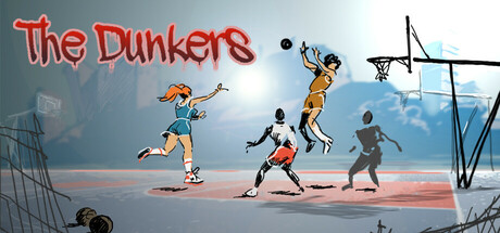
The Dunkers scored 77/100 on Steam Analyzer — Good for a Simulation capsule. Top priority fix: [brand_consistency] Introduce a signature character or visual motif (e.g., unique player silhouette, distinctive color accent, or iconic dunk pose) that anchors brand identity and supports recognition

Capsule scores by dimension

  • Genre Clarity: 9/10 — Basketball sport gameplay immediately clear. The capsule unmistakably communicates a basketball game through multiple visual cues: players in shooting pose mid-air, a basketball hoop in the upper right, court setting, and the energetic 2D animation style characteristic of arcade sports. At tiny size, the silhouettes of jumping players and the hoop remain instantly recognizable as basketball, with no ambiguity about genre or mechanic intent.
  • Title Readability: 8/10 — Bold neon red title stands out well. The title 'The Dunkers' uses a thick red neon-style outline font positioned in the upper left against a neutral gray-blue background, ensuring strong contrast and legibility at all sizes. At tiny size the lettering remains distinguishable, though fine serifs blur slightly; the bold weight and color separation against the background preserve readability across viewing scales.
  • Contrast & Color: 8/10 — Vibrant orange-red pops against blue-gray. The neon red title and warm orange tones of the player characters create strong value and hue separation from the cool blue-gray background and sky. Characters maintain clear silhouettes even at tiny size due to warm-to-cool contrast, and the red neon effect adds visual pop that supports quick visual scanning on a dark Steam background.
  • Uniqueness & Polish: 7/10 — Charming 2D style with energetic appeal. The hand-drawn 2D cartoon art style and playful character poses convey a lighthearted, indie aesthetic that differentiates it from photorealistic AAA sports titles. The composition and character expressions suggest fun and accessibility rather than simulation depth, though the overall execution feels confident; at small size the distinctive art direction helps it stand apart from generic sports fare.
  • Brand Consistency: 6/10 — Competent but limited visual identity signals. The capsule establishes a consistent warm color palette and 2D cartoon style aligned with the game's indie basketball focus, but lacks a strong iconic character, symbol, or distinctive motif that would create lasting brand recognition. The art style is cohesive and competent, but does not introduce a memorable visual hook unique to The Dunkers' identity.
  • Composition: 8/10 — Strong focal point with natural depth layering. The composition uses effective depth with background court elements and hoop on the right, mid-ground players in dynamic jumping poses across the center, and foreground silhouettes creating clear layering. The title sits safely in the upper left with ample margin, and the focal weight centers on the jumping players; at tiny size the arrangement remains readable with the hoop and players forming a cohesive primary subject.

What works

  • Genre immediately recognizable. Basketball sport is communicated clearly through player poses, hoop, and court setting that remain distinct even at thumbnail size.
  • Bold red title has strong presence. Neon-style lettering pops against the neutral background and maintains legibility across all viewing scales.
  • Warm-to-cool color contrast effective. Orange and red character tones separate well from blue-gray background, supporting visibility on Steam's dark interface.
  • Dynamic composition with clear focal point. Jumping players anchor visual attention in the center with supporting elements guiding the eye naturally through the scene.

What hurts the capsule

  • Limited brand identity signals. No iconic character, symbol, or signature visual hook to differentiate The Dunkers from other indie sports titles in memory.
  • Generic character silhouettes. Player figures lack distinctive design features or personality that would create lasting visual recognition or stand out in a library view.
  • Modest polish compared to benchmarks. While competent, the execution feels less refined and premium compared to top indie titles like Hades II or DAVE THE DIVER.

Priority fixes

  1. [brand_consistency] Introduce a signature character or visual motif (e.g., unique player silhouette, distinctive color accent, or iconic dunk pose) that anchors brand identity and supports recognition
  2. [uniqueness_polish] Enhance visual storytelling or add a unique hook that communicates The Dunkers' core appeal (e.g., keyboard control feedback, 1v1 mechanic emphasis, or retro arcade charm) more distinctly
  3. [title_readability] Consider adding a subtle drop shadow or outline to the red neon text to improve contrast preservation at the tiniest thumbnail size without sacrificing readability

Store copy priority fixes

  1. [hook_strength] Rewrite the opening to: 'Master pixel-perfect layups and brutal blocks in one-on-one streetball. The Dunkers brings 80s arcade basketball back with modern skill depth.' This leads with a verb and specific appeal instead of generic praise.
  2. [feature_communication] Expand the playstyle section: 'Choose your archetype: Shooter for deep range, Blocker for defensive lockdown, or Dunker for explosive finishes. Each has 100+ signature moves.' This explains why players would pick one type.
  3. [uniqueness] Add a differentiator line: 'Unlike static basketball sims, every frame of animation is hand-drawn and responsive to your inputs—arcade fluidity with real competitive depth.' This positions it against both retro games and modern sims.
  4. [tone_match] Standardize formatting and remove filler exclamation marks and puns; revise to professional-casual tone consistent with indie sports titles.

Related guides

Steam app ID: 3486980 · Tags: Simulation, Side Scroller, 2D, Colorful, Hand-drawn