Scoring genre clarity...

Emma's Umbrella capsule

Emma's Umbrella

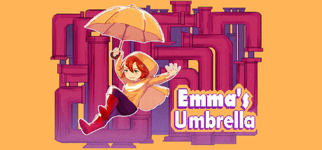
Emma's Umbrella is a challenging 2D precision platformer where you guide Emma through dangerous obstacles. Use her umbrella to create platforms, master precise movements, run, float, and wall-jump. Overcome tricky levels and help Emma find her way home!

$1.99Positive(11)
2D PlatformerAdventurePlatformer
Marcus Vinicius Moreira MariaJun 12, 2025

Emma's Umbrella scores 75/100 — better than 68% of 2D Platformer capsules (n=1,970).

Positive (11 reviews) · $1.99 · Released Jun 12, 2025 · By Marcus Vinicius Moreira Maria

Quick text summary

Emma's Umbrella scored 75/100 on Steam Analyzer — Good for a 2D Platformer capsule. Top priority fix: [uniqueness_polish] Add a subtle visual element that conveys challenge or progression—such as hazards, falling platforms, or environmental obstacles—to differentiate from generic platformer imagery.

Capsule scores by dimension

  • Genre Clarity: 7/10 — Platformer with unique mechanic. The character in mid-air with an umbrella clearly signals a platformer with a distinctive mobility mechanic. The stylized 2D character pose and suspended action read as indie platformer at all sizes. At TINY size, the umbrella and character silhouette remain recognizable, though the specific mechanic (umbrella-as-platform) requires familiarity with the title to fully understand.
  • Title Readability: 8/10 — Clear, bold, well-placed. The title 'Emma's Umbrella' uses a thick, friendly sans-serif font with white and outline stroke, positioned in the lower-center area against a controlled semi-transparent background. The text remains legible at SMALL and TINY sizes due to strong contrast and adequate letter spacing. No decorative elements compromise readability, and the tagline-free approach keeps focus sharp.
  • Contrast & Color: 8/10 — Strong warm palette separation. The warm orange-yellow background (#ffc571 approx.) creates excellent value contrast against the magenta and purple architectural elements and character. The umbrella pops as a bright yellow accent. At TINY size, the warm-cool separation holds well in grayscale, and the character silhouette remains distinct from background geometry.
  • Uniqueness & Polish: 7/10 — Charming art, moderate originality. The playful character design, warm color palette, and geometric cityscape suggest a cohesive indie aesthetic with personality. The umbrella mechanic is visually communicated through the character's pose and the prominent umbrella object. However, the overall composition and art style, while polished, fall within expected indie platformer visual conventions without a standout distinctive hook beyond the mechanic itself.
  • Brand Consistency: 7/10 — Consistent character and palette. The warm peachy-orange and magenta palette is distinctive and immediately recognizable for future marketing. The character Emma with her red hair and cheerful pose could serve as an iconic mascot. The geometric, modular architecture style creates internal cohesion, though without reference to the six store screenshots, it is difficult to assess full cross-asset consistency.
  • Composition: 8/10 — Balanced focal point with depth. Emma's character is the clear primary focal point, positioned in the upper-center area with the umbrella drawing the eye upward. The geometric background creates layered depth without competing for attention. The title placement in the lower area maintains safe margins and does not interfere with the character at any size. At TINY size, the composition remains cohesive with no critical edge-cropping concerns.

What works

  • Strong title contrast and legibility. White text with dark outline remains readable at TINY size against the controlled background region, ensuring discoverability in Steam store browse.
  • Warm color palette pops against dark background. The orange-yellow and magenta scheme creates excellent value separation from Steam's #1b2838 background, ensuring quick visual recognition during rapid scrolling.
  • Clear mechanic communication. The prominent umbrella and character's suspended pose immediately convey the core gameplay mechanic without requiring text explanation.
  • Coherent art direction. Character design, color palette, and geometric environment work together to create a consistent, recognizable visual identity.

What hurts the capsule

  • Generic indie platformer silhouette. While charming, the overall composition and layout follow common indie platformer capsule conventions without a standout distinctive visual hook that separates it from genre peers.
  • Limited visual storytelling. The capsule communicates 'character with umbrella in city' but does not convey emotional stakes, progression challenge, or a unique selling point beyond the mechanic itself.
  • Busy background geometry may distract. The dense magenta and purple modular architecture, while stylish, creates visual noise that competes slightly with the character focal point at smaller sizes.

Priority fixes

  1. [uniqueness_polish] Add a subtle visual element that conveys challenge or progression—such as hazards, falling platforms, or environmental obstacles—to differentiate from generic platformer imagery.
  2. [composition] Reduce background geometric complexity by simplifying or desaturating the magenta architecture to strengthen character focal point hierarchy at TINY size.
  3. [genre_clarity] Consider adding a subtle UI element (e.g., platform indicator, danger symbol, or level aesthetic) to reinforce the 'challenging precision platformer' positioning beyond the umbrella mechanic alone.

Related guides

Steam app ID: 3489990 · Tags: 2D Platformer, Adventure, Platformer, Pixel Graphics, 2D