Scoring genre clarity...
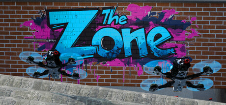
Learn new tricks, improve your freestyle flow, get inspiration by spectating other pilots, or learn to fly in the first place. The drone setup and physics are already dialed in by Pro pilots, so no need to mess with complicated settings.
$13.99Very Positive(35)
SimulationRacing3D
Nils Vollenbruch (@nils vo)Mar 7, 2025