Scoring genre clarity...

Set a Watch: Digital Edition capsule

Set a Watch: Digital Edition

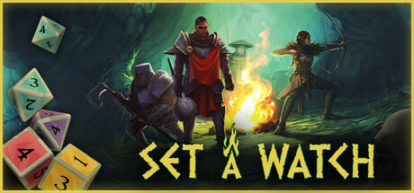
Assemble your party to survive in this dice-management game! Master steel and magic: roll dice and next use them to attack directly or for powerful abilities. Scout, light a fire, use ancient runes or equip perks to prepare before battle. Use tactics to fight monsters and Unhallowed. Set a watch!

$14.99Mostly Positive(21)
AdventureDungeon CrawlerTurn-Based Tactics
Acram DigitalJan 26, 2026

Set a Watch: Digital Edition scores 75/100 — better than 74% of Adventure capsules (n=7,922).

Mostly Positive (21 reviews) · $14.99 · Released Jan 26, 2026 · By Acram Digital

Quick text summary

Set a Watch: Digital Edition scored 75/100 on Steam Analyzer — Good for a Adventure capsule. Top priority fix: [composition] Increase dice visibility at TINY size by enlarging them slightly or adding a subtle glow rim to maintain mechanical clarity across all viewing scales

Capsule scores by dimension

  • Genre Clarity: 7/10 — Fantasy RPG with dice and tactics. The central party of armored fantasy characters in combat stance with visible magic effects (green glow, fire) signals tactical RPG gameplay. The colorful dice on the left clearly communicate the dice-management core mechanic. At TINY size, the silhouettes and bright magic read as fantasy action, though the specific dice-management focus becomes less obvious without the left-side dice being clearly visible.
  • Title Readability: 8/10 — Bold yellow text, clear hierarchy. The title 'SET A WATCH' uses a strong, high-contrast yellow font with a clean outline against the dark background, positioned in the lower third with ample breathing room. At FULL and SMALL sizes it reads clearly; at TINY size the letter forms remain distinct due to thick weight and high value separation. The tagline placement below is supportive without competing.
  • Contrast & Color: 8/10 — Strong value separation and saturation. Bright yellow title text and vibrant orange/yellow magic effects create excellent contrast against the dark teal-green background (#1b2838 simulation). The red armor of the lead character and golden fire effects stand out clearly in grayscale due to distinct value shifts. At TINY size the silhouettes and warm accents remain readable with clean edges.
  • Uniqueness & Polish: 7/10 — Solid execution with cohesive fantasy theming. The visual composition—party positioning, magical effects, and dice iconography—communicates the game's unique dice-management hook effectively without feeling generic. Character rendering is polished and intentional, though the overall aesthetic is in line with established fantasy RPG presentations rather than breaking new ground. The integration of dice as a prominent visual element is a smart, distinctive touch that elevates it above a standard fantasy party scene.
  • Brand Consistency: 7/10 — Coherent fantasy aesthetic, iconic dice motif. The capsule establishes a consistent dark-fantasy palette with warm magical accents that signal brand identity. The dice are a signature visual motif tied directly to the core mechanic and game title. Character silhouettes and warm lighting create a recognizable visual language, though without seeing all 6 screenshots, strong internal cohesion across the full set cannot be fully verified.
  • Composition: 8/10 — Clear hierarchy with strong focal point. The central party of three characters serves as the primary focal point, with the dice clustered on the upper left creating supporting visual weight without distraction. The title anchors the lower third, leaving safe margins and avoiding cropping issues. At SMALL and TINY sizes, the character group reads as the dominant element while the dice remain a recognizable secondary accent, creating good depth layering and intentional space usage.

What works

  • High-contrast yellow title. The bold, outlined 'SET A WATCH' text pops strongly against the dark background and remains readable even at TINY size due to thick letterforms and excellent value separation.
  • Dice-mechanic visual hook. The colorful dice on the left immediately communicate the game's core dice-management mechanic and differentiate it from generic fantasy RPGs.
  • Strong focal point hierarchy. The central party of characters creates a clear primary subject that dominates at all sizes while supporting elements guide the eye naturally without competing attention.
  • Polished character rendering. The fantasy party is rendered with clear silhouettes, distinct armor details, and vibrant magical effects that feel intentional and premium.

What hurts the capsule

  • Dice clarity at TINY size. While visible at full size, the individual dice details and their colorful faces become harder to parse at TINY thumbnail size, potentially losing the secondary mechanical hook.
  • Limited visual uniqueness. The overall fantasy party aesthetic, while competently executed, follows familiar genre conventions without a distinctive art style or visual signature that stands out in a crowded market.
  • Dark background density. The teal-green background has moderate texture and detail that, while not muddy, could benefit from slight simplification to further emphasize the character silhouettes at smaller sizes.

Priority fixes

  1. [composition] Increase dice visibility at TINY size by enlarging them slightly or adding a subtle glow rim to maintain mechanical clarity across all viewing scales
  2. [uniqueness_polish] Develop a more distinctive character design or add signature rune/marking elements that create a memorable visual identity beyond standard fantasy RPG conventions
  3. [contrast_color] Add a subtle vignette or value gradient to the background to further lift character silhouettes and reduce any mid-tone blending at small sizes

Store copy priority fixes

  1. [hook_strength] Replace 'Set a watch!' at the end of the short description with a direct statement of core appeal: 'Master dice management to survive waves of monsters and save the realm from darkness.' This removes the cryptic tagline and ends on the emotional payoff.
  2. [feature_communication] Restructure the detailed description with a bold 'Gameplay Loop' section that sequences the full turn: 'Roll dice → Choose your action (Attack, Scout, Heal, Equip, or Cast Runes) → Face the next monster wave.' This gives players a mental model.
  3. [uniqueness] Add 1–2 sentences explaining how the digital adaptation enhances the board game: e.g., 'Featuring streamlined rules, fast-resolution dice rolls, and seamless combo detection that would be cumbersome on tabletop—all without losing the tactical depth.' This justifies the format.
  4. [audience_targeting] Clarify the difficulty ceiling explicitly: 'For players who enjoy turn-based strategy and tactical puzzles with real consequence—if you loved [comp title], you'll master Set a Watch.' This helps fence the audience and set expectations.

Related guides

Steam app ID: 3493430 · Tags: Adventure, Dungeon Crawler, Turn-Based Tactics, Dice, Board Game