Scoring genre clarity...

Radio Ghosts capsule

Radio Ghosts

Radio Ghosts is a narrative game about geometry tests, vampire baristas, and camping with your mom.

$4.992 user reviews
AdventureStory RichRetro
B.J. BestJul 31, 2025

Radio Ghosts scores 75/100 — better than 74% of Adventure capsules (n=7,922).

2 user reviews · $4.99 · Released Jul 31, 2025 · By B.J. Best

Quick text summary

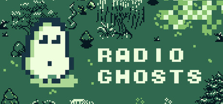
Radio Ghosts scored 75/100 on Steam Analyzer — Good for a Adventure capsule. Top priority fix: [genre_clarity] Add a subtle secondary visual element (e.g., a coffee cup, camping motif, or geometric shape) to hint at the game's unique narrative themes and differentiate from generic supernatural adventures.

Capsule scores by dimension

  • Genre Clarity: 7/10 — Clear supernatural adventure vibe. The pixel art ghost character and 'RADIO GHOSTS' text immediately signal a supernatural or spooky game with indie charm. At TINY size, the ghost silhouette remains recognizable and the title conveys the core theme. However, the genre remains somewhat ambiguous—it could be horror, adventure, or narrative-focused—and the pixelated aesthetic alone doesn't fully clarify the narrative/adventure focus mentioned in the description.
  • Title Readability: 8/10 — Bold, readable pixel typography. The 'RADIO GHOSTS' text uses clean, blocky pixel lettering in bright cream/white against the dark green background, ensuring strong contrast and legibility across all sizes. At TINY size, the text remains readable due to its substantial letterform size and weight. The title placement in the right half avoids the ghost character, allowing both elements to breathe without overlap.
  • Contrast & Color: 8/10 — Strong value separation, cohesive palette. The cream-colored ghost and title text pop clearly against the dark forest green background, creating excellent silhouette separation that survives the grayscale test. The pixelated foliage and scattered dark elements add visual interest without muddying the primary read. At TINY size, the light ghost and white text maintain clarity and distinction from the mid-tone green field.
  • Uniqueness & Polish: 7/10 — Charming pixel art with personality. The ghost character design is endearing and slightly whimsical rather than generic horror, aligning with the quirky narrative premise (vampire baristas, camping with mom). The pixel art style is well-executed and cohesive, though pixel art adventure games are increasingly common in indie spaces. The capsule communicates personality and restraint, avoiding overly dark or derivative imagery.
  • Brand Consistency: 7/10 — Consistent pixel aesthetic, recognizable motif. The ghost character serves as an iconic visual anchor that could become a memorable brand identity, and the pixel art style is internally coherent with clean rendering. The green forest palette and retro aesthetic suggest a consistent art direction across branding. Without seeing all 7 screenshots, it appears this ghost motif and pixel style would be recognizable across the game's visual suite.
  • Composition: 8/10 — Clear focal hierarchy, balanced layout. The ghost occupies the left-center area as the primary focal point, while the title anchors the right side, creating a natural left-to-right reading flow. The composition avoids clutter and dead space, with scattered foliage and particles framing the scene without competing for attention. At SMALL and TINY sizes, the two-element layout (ghost and title) remains clearly parsed with no ambiguity or edge-crop risk.

What works

  • Strong contrast and silhouette. The cream ghost and white text stand out sharply against the dark green, maintaining clarity even at tiny thumbnail size and in grayscale.
  • Clean pixel art execution. The ghost character is charming and well-rendered, avoiding generic horror tropes and communicating personality aligned with the quirky narrative premise.
  • Effective compositional balance. Ghost and title are well-separated with clear hierarchy, allowing both elements to be read instantly without visual competition or clutter.

What hurts the capsule

  • Ambiguous genre signal. While the ghost motif and pixel style suggest adventure or quirky gameplay, the capsule doesn't clearly communicate the narrative-focused adventure nature described in the game summary.
  • Limited visual storytelling. The capsule shows a ghost and title but doesn't hint at the distinctive selling points (geometry tests, vampire baristas, camping themes) that would differentiate it from generic pixel adventure games.

Priority fixes

  1. [genre_clarity] Add a subtle secondary visual element (e.g., a coffee cup, camping motif, or geometric shape) to hint at the game's unique narrative themes and differentiate from generic supernatural adventures.
  2. [uniqueness_polish] Consider incorporating a signature color accent or design motif that visually communicates the game's quirky tone and narrative hooks, making it more memorable at TINY size.

Store copy priority fixes

  1. [feature_communication] Replace 'non-Euclidean cartographic action' and 'crushing reality' with concrete verbs: add a sentence that explains the primary interaction model (e.g., 'explore a small town by walking to locations, talk to NPCs using your Z-key interaction, progress through story branches based on dialogue choices').
  2. [genre_clarity] Clarify the 'petty theft' and 'marine biology' references with specific context or remove them if they are misleading—currently they distract from the core walking simulator / narrative exploration experience.
  3. [feature_communication] After the first paragraph, add a clear summary of what happens across the 60-90 minute experience (e.g., 'You play as a sarcastic teenager camping with your mom, solve puzzles, meet quirky townspeople, and uncover a supernatural mystery') to anchor the player's mental model of progression.

Related guides

Steam app ID: 3494790 · Tags: Adventure, Story Rich, Retro, Female Protagonist, Narrative