Quick text summary
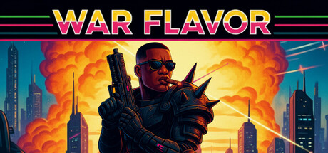
War Flavor scored 75/100 on Steam Analyzer — Good for a Futuristic capsule. Top priority fix: [uniqueness_polish] Introduce a visual element that communicates the time-as-life mechanic, such as a visible timer, hourglass motif, or clock face integrated into the protagonist or background.
Capsule scores by dimension
- Genre Clarity: 8/10 — Strong action arcade identity. The armed protagonist in sunglasses against explosions and urban skyline clearly signals action-arcade gameplay. At TINY size, the silhouette of the gunned character and orange explosion bursts still read as high-intensity action. The visual language matches run-and-gun expectations, though the specific Contra-inspired mechanic of time-as-life is not visually apparent from imagery alone.
- Title Readability: 8/10 — Bold, readable at all sizes. The yellow and magenta gradient title 'WAR FLAVOR' uses thick letterforms with strong contrast against the dark background. At SMALL and TINY sizes, the text remains clearly legible due to high saturation and weight. The horizontal scan lines framing the title add retro arcade polish without sacrificing readability.
- Contrast & Color: 8/10 — High-impact warm palette. Orange, red, and yellow explosion effects create strong value separation against the cool blue urban background and dark Steam overlay. The protagonist's dark silhouette pops clearly against the bright central explosion, maintaining clarity in grayscale. At TINY size, the warm-cool split still reads as distinct regions with good silhouette separation.
- Uniqueness & Polish: 7/10 — Polished arcade aesthetic. The retro scan-line effects, neon color grade, and confident composition show intentional art direction that evokes 1980s action arcade style. The sunglassed protagonist and explosive cityscape suggest personality, though the visual execution feels familiar within the action-arcade subgenre. The overall craft is clean but not distinctly memorable compared to top-tier action game capsules.
- Brand Consistency: 6/10 — Coherent but generic styling. The retro-neon aesthetic is internally consistent with scan lines, warm explosions, and cool urban backdrop creating a unified color story. However, there are no immediately iconic character traits, symbol, or signature visual motif that would create lasting brand recognition independent of this image. The presentation feels more like a stylistic choice than a core brand identity.
- Composition: 8/10 — Strong hierarchical focal point. The armed protagonist occupies the dominant center-right zone with the explosion burst as the primary visual anchor, creating clear hierarchy. Supporting cityscape elements frame the background without competing for attention. The title placement above the character leaves safe margins, and the composition remains readable across SMALL and TINY sizes without critical element loss at edges.
What works
- Title legibility across sizes. Yellow-magenta gradient with thick strokes and surrounding scan lines maintains readability even at TINY thumbnail scale.
- Warm-cool color contrast. Orange explosions and cool blue cityscape create strong value separation that pops against the dark Steam background in quick scroll.
- Clear action-arcade messaging. Armed protagonist, explosions, and urban setting immediately signal the run-and-gun gameplay without ambiguity about genre.
- Intentional retro aesthetic. Scan lines, neon color grading, and sunglasses evoke 1980s arcade style with polished execution and internal consistency.
What hurts the capsule
- Generic visual language. While well-executed, the armed protagonist against explosions is a common action game trope that lacks distinctive visual hook or unique selling point.
- No memorable brand symbol. The capsule conveys style but offers no iconic character trait, logo, or visual motif that would create lasting recognition separate from the image.
- Core mechanic invisibility. The time-as-life mechanic central to War Flavor's identity is completely absent from visual communication; capsule reads as generic action game.
Priority fixes
- [uniqueness_polish] Introduce a visual element that communicates the time-as-life mechanic, such as a visible timer, hourglass motif, or clock face integrated into the protagonist or background.
- [brand_consistency] Add a distinctive character signature or recurring symbol (weapon design, armor detail, or UI element) that could become recognizable across future marketing.
- [genre_clarity] Consider adding a subtle UI or HUD element (score counter, timer display, or arcade cabinet frame) to reinforce the specific run-and-gun-as-arcade-game identity.
Store copy priority fixes
- [feature_communication] Expand the co-op section with 2-3 sentences explaining how co-op gameplay works, whether it supports local or remote play, and how it changes the time mechanic or difficulty—currently it is mentioned only in passing.
- [audience_targeting] Add a difficulty or accessibility statement such as 'Available in Standard and Casual modes' or 'Designed for both arcade veterans and newcomers' to clarify who should buy and signal approachability.
- [feature_communication] Clarify the relationship between '8 story levels' in Classic Mode and '9 levels' in Challenge Mode, and explain what progression or unlocks carry between modes.
- [uniqueness] Strengthen the visual aesthetic paragraph by leading with the visual style as a core differentiator: move 'striking arcade aesthetic reminiscent of Paper Mario-style presentation' to prominence rather than burying it as a technical note.
Related guides
Steam app ID: 3496650 · Tags: Futuristic, 3D Platformer, Atmospheric, Platformer, Action