Scoring genre clarity...
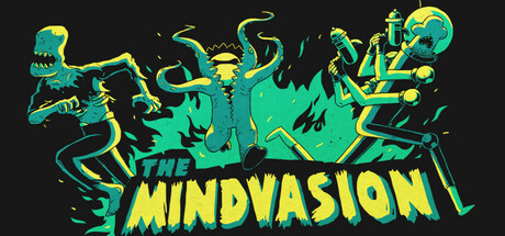
What's more frustrating than watching an army of monsters fail to wipe out humanity? Take control of a minion and turn the tide in a roguelite survival game. Just died? No problem—another creature is ready to be possessed. Keep the carnage going and make sure humanity meets its end!
$2.99Positive(14)
CasualActionBullet Hell
MastodonteJun 26, 2025