Scoring genre clarity...

Ice 'Em: Race to the Grave capsule

Ice 'Em: Race to the Grave

High-octane real-time strategy. Put the pedal to the metal, jump between speeding cars, and slam the competition off the road! No need to survive as long as your marks lose... their life!

$9.99No user reviews
StrategyRTS2D
Paul CooneyAug 29, 2025

Ice 'Em: Race to the Grave scores 65/100 — better than 10% of Strategy capsules (n=5,103).

No user reviews · $9.99 · Released Aug 29, 2025 · By Paul Cooney

Quick text summary

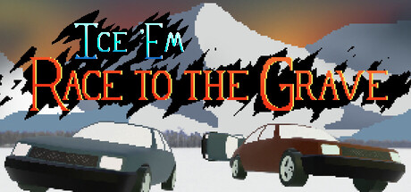
Ice 'Em: Race to the Grave scored 65/100 on Steam Analyzer — Solid for a Strategy capsule. Top priority fix: [title_readability] Add a thin dark outline or shadow to 'RACE TO THE GRAVE' orange text to maintain legibility and prevent blur collapse at tiny sizes.

Capsule scores by dimension

  • Genre Clarity: 7/10 — Racing gameplay with dark humor. The pixelated cars racing head-to-head against a snowy mountain backdrop immediately signal a racing game, while the skull-laden title 'Race to the Grave' with orange fire lettering establishes the dark humor tone. At tiny size, the two vehicles and competitive setup remain readable, though the strategy layer is less obvious without the description context.
  • Title Readability: 6/10 — Readable at full, struggles tiny. The title splits across two lines with 'ICE 'EM' in cyan and 'RACE TO THE GRAVE' in orange gradient—both are legible at full header size with decent contrast against the sky background. However, at tiny thumbnail size (~120x45), the orange text becomes dense and blurry, and the overall hierarchy collapses into a muddy band of color that loses individual letterform clarity.
  • Contrast & Color: 7/10 — Warm orange pops, cool cyan balances. The orange fire gradient on 'RACE TO THE GRAVE' contrasts well against the cool blue-grey snowy environment, and the cyan 'ICE 'EM' adds complementary color separation. The cars and white snow provide clear silhouettes against the darker gradient sky, though at tiny size the mid-tone sky gradient softens the overall pop and the cars blur into the background slightly.
  • Uniqueness & Polish: 6/10 — Competent retro aesthetic, generic execution. The pixel-art cars and snowy mountain setting evoke classic arcade racing games with thematic dark humor, but the execution feels like a standard indie game mashup rather than a distinctive visual hook. The jagged black wing graphics and flame lettering are functional but don't communicate a unique mechanic or memorable art signature beyond 'cars + death theme.'
  • Brand Consistency: 6/10 — Coherent but no memorable identity. The color palette (orange, cyan, white, grey, black) and pixel-art style are internally consistent across the visible capsule elements. However, without reference to store screenshots, there are no distinctive brand motifs, character silhouettes, or signature visual patterns that would make this capsule instantly recognizable as belonging to this specific game versus other retro racing titles.
  • Composition: 7/10 — Clear focal point, balanced layout. The two racing cars occupy the center-lower third as the primary subject, with the mountain and sky forming a strong background layer and the title anchoring the top. The layout has good depth separation and the title placement on the sky avoids clutter, though at small sizes the cars compress vertically and lose definition, and the title text risks getting cut or becoming illegible on narrow viewports.

What works

  • Thematic title design. The dual-color title (cyan 'ICE 'EM' + orange fire 'RACE TO THE GRAVE') reinforces the game's dark humor and racing theme in a single glance.
  • Clear competitive focal point. The two pixelated cars facing off in the center immediately communicates multiplayer racing conflict and establishes genre at full size.
  • Effective color separation. Warm orange and cool cyan create complementary contrast that helps the title and scene elements pop against the Steam dark background.

What hurts the capsule

  • Title illegibility at tiny size. The orange 'RACE TO THE GRAVE' text becomes a blurry warm band at 120x45px, losing individual letterforms and readability during quick scrolling.
  • Generic pixel-art execution. The retro car sprites and snowy mountain backdrop feel like standard asset-kit components rather than a distinctive or memorable visual style.
  • Strategy layer invisible. The real-time strategy core mechanic is not visually communicated; the capsule reads as pure racing without hinting at the jump-between-cars or tactical element.
  • Soft mid-tone sky gradient. The background sky uses muted blue-grey tones that don't push values far enough apart, causing cars to lack crisp silhouette separation at small sizes.

Priority fixes

  1. [title_readability] Add a thin dark outline or shadow to 'RACE TO THE GRAVE' orange text to maintain legibility and prevent blur collapse at tiny sizes.
  2. [genre_clarity] Introduce a visual hint of the strategy mechanic—such as an icon or UI element suggesting 'jump/swap' between vehicles—to differentiate from generic racing games.
  3. [contrast_color] Increase the value range of the background sky gradient (darken shadows or brighten highlights) to push cars into sharper silhouette separation at all sizes.
  4. [uniqueness_polish] Refine the pixel-art cars or mountain with more distinctive detail or style flourish that signals this game's unique dark-humor identity.

Store copy priority fixes

  1. [feature_communication] Expand the 'real-time pause' section to explicitly explain how unit positioning works: 'Stop time to reposition gunners across your convoy, assign drivers to different cars, or swap passenger roles—then resume for real-time combat.' This clarifies the core strategic loop.
  2. [feature_communication] Replace 'Dozens of unique targets to defeat' with a concrete example that shows how target choice affects strategy: 'Each enemy requires a different approach—machine gunners need flanking, medics must be eliminated first, radio operators can call reinforcements. Choose your target order to control the battlefield.'
  3. [audience_targeting] Add a sentence clarifying skill floor and playstyle: 'Ideal for strategy fans who love pausing to plan, but accessible without timed input.' This addresses the 'Playable without Timed Input' category and sets expectations.
  4. [uniqueness] Strengthen the hijacking mechanic's uniqueness: Change 'use their own motorpool against them' to 'steal your enemy's upgraded vehicles mid-battle and turn them against their owners.' This makes the mechanic feel more distinctive and high-stakes.

Related guides

  • Steam page optimisationCapsule, copy, screenshots, tags — the full Steam page conversion stack.
  • Steam tags guideTag selection, ordering, and how it shapes Steam's recommendation rails.

Steam app ID: 3500450 · Tags: Strategy, RTS, 2D, Pixel Graphics, Driving