Scoring genre clarity...

GET 0UT capsule

GET 0UT

A puzzle-solving horror game about an Unknown person who cannot remember his past and finds himself in a never-ending cycle/loop, trying to find answers about who he is and why he is suffering in this unknown place.

$9.992 user reviews
ActionStrategyHorror
ICE9 GamesMay 16, 2025

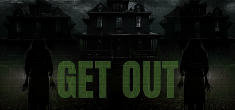
GET 0UT scores 68/100 — better than 17% of Action capsules (n=8,534).

2 user reviews · $9.99 · Released May 16, 2025 · By ICE9 Games

Quick text summary

GET 0UT scored 68/100 on Steam Analyzer — Solid for a Action capsule. Top priority fix: [uniqueness_polish] Introduce a signature visual element or symbolic motif (iconic object, unique character design, or distinctive palette shift) that reflects the puzzle-loop mystery core mechanic and differentiates the capsule from standard horror templates.

Capsule scores by dimension

  • Genre Clarity: 7/10 — Horror-puzzle loop implied clearly. The haunted mansion silhouette, two menacing figures in foreground, and green sickly title text immediately signal horror with psychological undertones. At TINY size, the gothic architecture and figure poses read as horror-adjacent, though the puzzle-solving loop mechanic itself is not visually communicated. The genre cues are strong enough for horror recognition, but the cycling/temporal mystery element remains invisible in the visual language.
  • Title Readability: 8/10 — Bold title readable at all sizes. The large green capital letters 'GET OUT' are positioned centrally with strong value contrast against the darker background, maintaining legibility from FULL down to TINY size. The clean sans-serif letterforms and thick stroke weight ensure the title does not collapse under scaling. Minor spacing is natural and supports rapid recognition during quick scrolls.
  • Contrast & Color: 8/10 — Strong green-on-dark separation. The acid green title text (#4a8c3a approximate) creates excellent value separation against the #1b2838 Steam background and dark mansion imagery. The silhouettes of the two figures read clearly in grayscale, with defined edges against the moody mid-tone sky. The color choice is saturated and deliberate, popping immediately even at TINY size without muddy blending.
  • Uniqueness & Polish: 6/10 — Competent horror aesthetic, generic execution. The haunted mansion and shadowy figures are familiar horror tropes that lack a distinctive visual hook beyond the green title treatment. The composition and image quality are professional, but the scene feels like a standard horror game template rather than a memorable branded identity specific to the puzzle-loop mystery narrative. Against top-tier indie horror like DREDGE or Hellblade II, this reads as competent but not distinctive.
  • Brand Consistency: 5/10 — No recognizable branded motifs present. The capsule uses generic horror mansion and figure silhouettes with no iconic character, symbol, or signature visual element that could serve as a recognizable identity marker across screenshots or media. The green title color is the only potential brand signal, but it is not reinforced by interior visual language or coherent palette from the game's other assets. The rendering style is straightforward photographic without a distinctive art direction that builds brand recall.
  • Composition: 7/10 — Clear focal hierarchy, balanced depth. The two shadowed figures occupy the midground with the mansion looming in the background, creating natural depth layering that guides attention without clutter. The green title text anchors the center of the composition with clear hierarchy over supporting elements. At SMALL and TINY sizes, the eye reads the title first, then the ominous figures; the layout survives cropping and maintains primary subject clarity, though the lower figures risk edge clipping on some Steam display contexts.

What works

  • Title legibility at scale. The bold green 'GET OUT' lettering maintains crisp readability from full header down to tiny thumbnail without degradation or outline collapse.
  • Horror genre signaling. Haunted mansion architecture and shadowed human figures immediately communicate the horror theme to players scrolling at speed.
  • Color contrast against background. The acid green text pops distinctly against both the dark mansion and Steam's dark UI, ensuring discoverability in browsing.

What hurts the capsule

  • Generic visual identity. The mansion and figure silhouettes lack a distinctive branded element or unique visual hook that differentiates it from other horror games.
  • No puzzle-loop mechanic hinted. The visual composition does not communicate the core puzzle-solving and time-loop cycle that define the game's unique selling point.
  • Lack of art direction signature. The photographic rendering style and generic horror iconography fail to establish a memorable or recognizable brand aesthetic.

Priority fixes

  1. [uniqueness_polish] Introduce a signature visual element or symbolic motif (iconic object, unique character design, or distinctive palette shift) that reflects the puzzle-loop mystery core mechanic and differentiates the capsule from standard horror templates.
  2. [brand_consistency] Reinforce brand identity by incorporating a consistent visual symbol, glyph, or UI element from the game's interface that appears across store screenshots and strengthens recognition.
  3. [genre_clarity] Add a subtle visual cue that hints at the temporal loop or puzzle-solving mechanic—such as recursive visual layering, a clock motif, or overlapping frames—to communicate the unique gameplay loop beyond standard horror.

Store copy priority fixes

  1. [hook_strength] Rewrite the short description opening line to lead with the core loop mechanic and psychological tension instead of restating the genre: e.g., 'You wake with no memory, trapped in a looping nightmare. Each attempt to escape reveals new horrors—but your cursed companion remembers everything you cannot.'
  2. [tone_match] Remove or significantly rewrite the tutorial-style mechanics sections (inventory instructions, key usage steps). Integrate these mechanics into narrative-driven explanations or a separate 'How to Play' section to preserve atmospheric horror tone in the main copy.
  3. [feature_communication] Restructure the detailed description into clear sections: Story/Setting, Core Mechanics (fear system, loop, bomb defusal), Key Features (cursed book, multiple endings), and Difficulty. Use consistent formatting and prioritize gameplay clarity over lore.
  4. [audience_targeting] Add a sentence clarifying the intended player: e.g., 'Designed for players who embrace psychological horror, environmental puzzles, and the challenge of mastering systems through repeated playthroughs' to signal who should feel this is made for them.

Related guides

Steam app ID: 3500720 · Tags: Action, Strategy, Horror, Psychological Horror, Puzzle