Scoring genre clarity...

Spacegolf! capsule

Spacegolf!

Spacegolf! Golf your way through the universe while watching the narrative unfold about the unsettling circumstances surrounding the Dark Star Corporation.

$2.994 user reviews
GolfMini GolfSpace
Not A Ninja StudiosNov 25, 2025

Spacegolf! scores 72/100 — better than 27% of Golf capsules (n=67).

4 user reviews · $2.99 · Released Nov 25, 2025 · By Not A Ninja Studios

Quick text summary

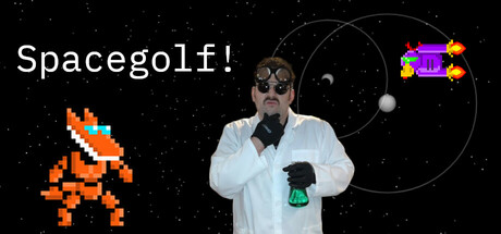
Spacegolf! scored 72/100 on Steam Analyzer — Good for a Golf capsule. Top priority fix: [composition] Reduce or reposition the purple spaceship and orbital UI elements to secondary placement (lower right or upper corner) to give the scientist character undisputed focal point dominance.

Capsule scores by dimension

  • Genre Clarity: 7/10 — Golf theme clear, space setting obvious. The pixel art golf ball sprite (orange/yellow) in the lower left and the space backdrop with planets and orbital lines immediately signal a golf + space combination. At tiny size, the pixel ball and starfield remain readable, though the narrative focus on Dark Star Corporation is not visually apparent. Genre signals are strong enough for casual/golf categorization, but the whimsical tone competes with any darker story implications.
  • Title Readability: 8/10 — White sans-serif title legible throughout. The 'Spacegolf!' title in white sans-serif sits cleanly in the upper left on a dark starfield background, providing excellent contrast and readability at all sizes. At tiny size, the title remains clearly parseable due to simple letterforms and high value separation. The exclamation mark adds personality without harming legibility.
  • Contrast & Color: 8/10 — Strong light-dark separation, clean silhouettes. White title text and the scientist character's light clothing pop distinctly against the black starfield background. The orange pixel golf ball provides warm accent contrast. At small and tiny sizes, the silhouettes of the character and orbital elements remain clear due to strong value contrast, though the grayscale test shows mid-tone planets blend slightly into the dark space background.
  • Uniqueness & Polish: 7/10 — Quirky character and nostalgic pixel art appeal. The scientist character in a white coat with goggles and confident pose conveys personality and suggests a humorous, retro-futuristic tone. The pixel art golf ball and space UI elements feel intentional and cohesive. However, the composition relies on familiar indie game tropes (pixel art + eccentric character + space theme) without a singular distinctive visual hook that separates it from comparable casual games like Balatro or similar titles.
  • Brand Consistency: 6/10 — Coherent retro-sci-fi aesthetic, limited identity markers. The art direction is internally consistent: pixel art, scientist character, space motifs, and a playful tone align well. However, without access to store screenshots, the capsule lacks a distinctive brand signature (iconic symbol, recurring character treatment, or unique color palette) that would make this recognizable across multiple touchpoints. The aesthetic is competent but does not yet feel like a strong, iconic brand identity.
  • Composition: 7/10 — Clear hierarchy, slightly cluttered mid-ground. The scientist character occupies the visual center as the primary focal point, with the title anchored upper left and the space UI elements (purple spaceship, orbital circle) in the upper right. At tiny size, the central character and title remain the dominant reading, though the multiple space elements (planets, orbits, pixel ball, ship) create competing focal points. Safe margins are respected, but the scene feels slightly crowded in the middle register without a clear background-to-foreground layering depth.

What works

  • High-contrast title placement. White 'Spacegolf!' text on dark starfield is immediately legible at all sizes, from full header to tiny thumbnail.
  • Personality-driven character. The scientist figure with goggles and confident pose communicates a quirky, humorous tone that differentiates the game from generic space sims.
  • Cohesive retro-futuristic aesthetic. Pixel art, space elements, and nostalgic visual language work together without jarring mismatches or style conflicts.

What hurts the capsule

  • Competing focal points in upper right. The purple spaceship and orbital UI elements compete for attention with the main character and risk visual clutter at small sizes.
  • Lack of distinctive brand signature. While competent, the capsule lacks an iconic character trait, recurring motif, or unique color palette that would be instantly recognizable across other materials.
  • Dark planet silhouettes blend into background. The orbital planets and some mid-tone space elements lose definition in grayscale contrast test, weakening the starfield backdrop's visual separation.

Priority fixes

  1. [composition] Reduce or reposition the purple spaceship and orbital UI elements to secondary placement (lower right or upper corner) to give the scientist character undisputed focal point dominance.
  2. [brand_consistency] Introduce a recurring visual motif or signature color accent (e.g., highlight the Dark Star logo or a unique golf ball design) that becomes the game's iconic marker across all assets.
  3. [contrast_color] Add subtle glow or rim lighting to the orbital planets to increase silhouette separation from the black starfield and improve tiny-size readability.

Store copy priority fixes

  1. [feature_communication] Move 'Gameplay Overview' to the second paragraph of the detailed description, before the narrative setup, so players scanning the page find 'how you play' before 'what the story is about.'
  2. [hook_strength] Replace 'unsettling circumstances' in the short description with a more specific and evocative phrase that hints at the narrative conflict, e.g., 'while uncovering a sinister secret lurking within Dark Star Corporation' to create intrigue rather than vagueness.
  3. [audience_targeting] Add a single clarifying sentence after the short description stating whether this game prioritizes narrative immersion with casual play or strategic puzzle-solving, e.g., 'Enjoy a story-driven experience with gentle puzzle solving' or 'Master complex planetary physics in this narrative-wrapped challenge.'
  4. [tone_match] Revise the Gameplay Overview opener to adopt the theatrical tone of the narrative, e.g., 'In this cosmic golfing endeavor, each planet presents unique challenges:' rather than 'As expected in golf,' to create tonal consistency throughout the page.

Related guides

Steam app ID: 3502670 · Tags: Golf, Mini Golf, Space, Story Rich, Physics