Scoring genre clarity...

The Haunting of Ptolemy capsule

The Haunting of Ptolemy

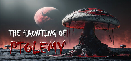
The Haunting of Ptolemy is a first-person shooter game. The game features a variety of weapons, which will be needed for protection against some of the indigenous life forms. Collect the spore samples, transport them back, outmaneuver the obstacles and traps, and above all, Stay Alive!

$3.991 user reviews
ActionAdventureAction-Adventure
Lee E. PowellApr 22, 2025

The Haunting of Ptolemy scores 62/100 — better than 3% of Action capsules (n=8,535).

1 user reviews · $3.99 · Released Apr 22, 2025 · By Lee E. Powell

Quick text summary

The Haunting of Ptolemy scored 62/100 on Steam Analyzer — Solid for a Action capsule. Top priority fix: [title_readability] Replace red neon PTOLEMY with high-contrast white or yellow text on a semi-transparent dark backing to ensure legibility at TINY size and reduce the two-part title split.

Capsule scores by dimension

  • Genre Clarity: 7/10 — Sci-fi horror shooter clearly signaled. The alien mushroom structure, hostile red planet atmosphere, and ominous silhouette composition immediately communicate a sci-fi horror setting with survival gameplay implied. At TINY size, the distinctive mushroom-umbilical form and red color scheme still read as alien and threatening, though genre specificity (FPS) is less obvious without seeing weapon details.
  • Title Readability: 5/10 — Title split, contrast inconsistent. THE HAUNTING OF appears in readable white text at full size, but PTOLEMY is rendered in red neon-style lettering that struggles against the dark sky background. At TINY size, PTOLEMY becomes difficult to parse and the two-line split creates hierarchy confusion; the red neon effect looks stylish but sacrifices clarity at small scales.
  • Contrast & Color: 6/10 — Strong atmosphere, weak title separation. The red planet and mushroom structure create good value separation from the dark sky, establishing clear silhouettes and atmospheric mood against the Steam dark background. However, the red neon title text does not have enough luminance contrast against the darker mid-tones, and at TINY size the entire composition risks becoming a muddy red-gray blur.
  • Uniqueness & Polish: 7/10 — Distinctive alien environment, generic presentation. The inverted-umbrella alien structure and desolate red-planet aesthetic create a memorable visual hook that differentiates it from standard shooter capsules. However, the overall composition and effect execution feel conventional for indie sci-fi horror—competent but not distinctly premium compared to benchmarks like The Invincible or Pacific Drive.
  • Brand Consistency: 6/10 — Cohesive but not distinctive identity. The red-and-dark color palette and alien environment feel internally consistent and align with a survival-horror tone, but there are no iconic character, symbol, or signature visual motifs that would make this capsule instantly recognizable on a store page. The presentation lacks memorable identity markers beyond the generic sci-fi aesthetic.
  • Composition: 6/10 — Balanced layout, title placement risks. The mushroom structure anchors the center-right focal point with good depth layering (foreground silhouette, mid-tone planet, dark sky background), creating visual interest across the width. However, the two-part title placement—white text top-left and red neon bottom-center—splits attention and the red neon sits dangerously close to potential edge cropping; at SMALL and TINY sizes the layout loses coherence.

What works

  • Atmospheric world-building. The red planet, moon, and alien mushroom structure instantly communicate a hostile extraterrestrial setting with strong visual storytelling.
  • Clear central focal point. The inverted-umbrella structure silhouette is distinctive and draws the eye naturally, creating a memorable anchor for the composition.
  • Strong value contrast on background. The red and mid-gray alien elements separate cleanly from the dark sky, maintaining readability at full size.

What hurts the capsule

  • Red neon title poor contrast. PTOLEMY in red neon lettering does not have sufficient luminance separation from the dark background and becomes illegible at TINY size.
  • Title hierarchy confusion. Split across white and red text in two locations (top-left and bottom-center) creates competing focal points that weaken the read at small sizes.
  • Generic identity markers. No distinctive character, logo, or visual motif differentiates this capsule from other indie sci-fi horror games; reliance on environmental aesthetics alone is not enough.
  • Layout vulnerability at small sizes. The bottom-center red neon text risks crop cutoff and the overall composition loses spatial clarity when compressed to SMALL and TINY viewing modes.

Priority fixes

  1. [title_readability] Replace red neon PTOLEMY with high-contrast white or yellow text on a semi-transparent dark backing to ensure legibility at TINY size and reduce the two-part title split.
  2. [contrast_color] Add a thin bright outline or glow to the title text to increase separation from the mid-tone background and maintain readability in grayscale.
  3. [composition] Consolidate title to a single prominent location in the safe upper region (avoiding edges) and ensure all text elements are sized to remain readable at 120x45 thumbnail scale.
  4. [uniqueness_polish] Consider adding a distinctive character silhouette, weapon outline, or recurring visual symbol to the design that reinforces brand identity beyond generic sci-fi scenery.

Store copy priority fixes

  1. [hook_strength] Rewrite the opening to lead with the emotional conflict: 'A research station goes silent on a hostile moon. You're sent alone to find out why—and survive whatever killed the last team.' This replaces the job briefing with personal jeopardy.
  2. [uniqueness] Add a sentence describing one concrete differentiator: e.g., 'Spore samples warp reality, altering level geometry and enemy behavior' or 'Solve environmental puzzles using weapon effects to unlock new areas.' Show what makes Ptolemy distinct from other sci-fi shooters.
  3. [feature_communication] Replace vague action verbs with specific mechanics: instead of 'outmaneuver obstacles and traps,' describe what players actually do—'disable laser grids, navigate zero-gravity shafts, or hack alien machinery to progress.'
  4. [audience_targeting] Add a line signaling difficulty and player type: 'For players who enjoy methodical exploration and resource scarcity' or 'Hardcore survival mode: limited ammo, no compass, permadeath' to clarify who this is built for.

Related guides

Steam app ID: 3504130 · Tags: Action, Adventure, Action-Adventure, Puzzle, Dungeon Crawler