Quick text summary
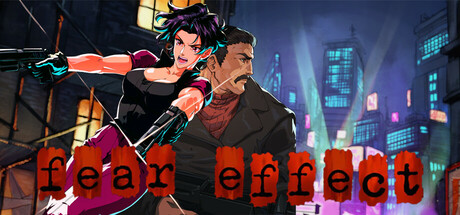
Fear Effect scored 60/100 on Steam Analyzer — Solid for a Action capsule. Top priority fix: [title_readability] Relocate title to a dedicated safe zone above or below the character group with a dark background panel or outline to guarantee tiny-size legibility.
Capsule scores by dimension
- Genre Clarity: 7/10 — Action-adventure gameplay clear. Two characters in combat stance with weapons against a neon-lit urban environment immediately signal action-adventure gameplay. The cel-shaded art style and dynamic pose hierarchy communicate cinematic action rather than puzzle or exploration focus. At tiny size, the silhouettes and weapon positioning still read as combat-oriented, though genre specificity softens slightly.
- Title Readability: 4/10 — Title severely compromised tiny. The red 'fear effect' text sits directly over a busy magenta gradient and overlapping character bodies, creating poor contrast and collision with visual noise. At tiny size (120x45), the letterforms blur and fragment against the background; at small size (231x87), readability improves but the placement remains unsafe and competes with character silhouettes. The title lacks a dedicated safe zone or outline protection.
- Contrast & Color: 6/10 — Adequate separation with issues. Characters and neon cityscape provide reasonable value separation from the dark background, with warm orange and cyan accent lights creating pop. However, the magenta/purple gradient in the lower half muddles the separation of the title from the background, and mid-tone skin tones blend slightly into darker jacket areas. Grayscale squint test shows decent silhouette but the title area loses definition.
- Uniqueness & Polish: 6/10 — Competent but familiar execution. The cel-shaded character rendering and neon-soaked urban setting are well-crafted and thematically appropriate for a cinematic action game, but this specific combination is common in modern action-adventure marketing. The composition and lighting are professionally executed, yet lack a distinctive visual hook or narrative moment that differentiates it from similar genre capsules like Lies of P or Jedi: Survivor.
- Brand Consistency: 6/10 — Style cohesive internally. The cel-shaded rendering, character design, and neon cyberpunk aesthetic are internally consistent and align with the Fear Effect franchise legacy. However, without strong iconic character recognition or a unique motif beyond 'two fighters in neon city,' the capsule lacks a memorable identity signal that would make it immediately recognizable on a store shelf. The visual language is polished but doesn't communicate a unique brand hook.
- Composition: 7/10 — Clear focal point, safe structure. The two-character group forms a strong primary focal point in the upper-center region, with the cityscape providing layered background depth and supporting context. The composition avoids dead space and respects safe margins reasonably well, though the title placement at the bottom edge sits dangerously close to crop risk. At tiny size, the character silhouettes remain the dominant read, and the hierarchy holds.
What works
- Character silhouette clarity. The two-character dynamic pose and distinct clothing (black jacket, brown leather) create clear visual separation and strong focal hierarchy that reads well at all sizes.
- Depth layering. Background cityscape with neon glow, midground characters, and foreground action stance create believable three-dimensional composition that supports the cinematic action theme.
- Neon accent lighting. Warm orange and cool cyan light sources provide tactical visual pop against the dark Steam background without overwhelming the composition.
What hurts the capsule
- Title-background collision. Red 'fear effect' text overlaps magenta gradient and character bodies, severely compromising readability at small and tiny sizes.
- Generic action-adventure hook. While well-rendered, the neon-city two-fighter setup lacks a distinctive narrative or mechanic signal that differentiates it from competing action-adventure capsules.
- Weak brand identity. No iconic motif, symbol, or signature visual cue that would make this recognizable as Fear Effect specifically versus generic cyberpunk action.
Priority fixes
- [title_readability] Relocate title to a dedicated safe zone above or below the character group with a dark background panel or outline to guarantee tiny-size legibility.
- [uniqueness_polish] Introduce a signature Fear Effect visual element—e.g., a distinctive UI frame, logo, or thematic symbol—to elevate brand identity and memorability.
- [composition] Reduce clutter in the lower magenta gradient zone and ensure title sits on a high-contrast backing to restore silhouette separation.
Store copy priority fixes
- [feature_communication] Replace 'Revolutionary Motion FX technology' with a concrete gameplay explanation: e.g., 'Motion FX technology overlays dynamic action sequences onto full-motion-video environments, letting you guide your team through unscripted combat moments.'
- [hook_strength] Strengthen the short description by replacing 'pioneering cel-shaded cinematic action game' with a more immediate gameplay hook: 'Lead three ruthless mercenaries through Hong Kong's underworld in this cel-shaded action-thriller where every choice echoes.'
- [uniqueness] Add a comparative differentiator in the detailed description to clarify what makes this revival notable: e.g., 'Remaster or technical improvements' or 'First time the full experience is available on modern PC.'
Related guides
Steam app ID: 3504570 · Tags: Action, Action-Adventure, Female Protagonist, Shooter, Third-Person Shooter