Fighting Force Collection scores 72/100 — better than 46% of Action capsules (n=8,534).

Quick text summary

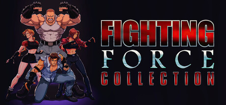
Fighting Force Collection scored 72/100 on Steam Analyzer — Good for a Action capsule. Top priority fix: [title_readability] Replace serif 'FIGHTING FORCE' with bold sans-serif outline font that maintains clarity and stroke weight at 120px thumbnail size.

Capsule scores by dimension

  • Genre Clarity: 8/10 — Clear beat 'em up action. Multiple muscular characters in combat poses with dynamic stances immediately signal fighting game genre. At tiny size, the silhouettes of bulky fighters and the aggressive posturing remain legible and genre-appropriate. The composition of stacked characters reinforces multiplayer brawler DNA rather than 1v1 fighting game.
  • Title Readability: 7/10 — Readable but serif breaks down tiny. Title uses red metallic serif lettering with strong outline against dark background at full size, reading clearly. At small and tiny sizes the serifs on 'FIGHTING FORCE' become fuzzy and the secondary 'COLLECTION' text drops to marginal legibility due to thin stroke weight. The overall placement on right side maintains separation from character clutter, which helps.
  • Contrast & Color: 8/10 — Strong warm orange-red pop. Warm orange and flesh tones of the characters create excellent value separation against the cool dark blue-black background. Red metallic text reinforces the warm color dominance and reads distinctly in grayscale due to luminosity lift. The silhouettes remain clean and defined even when squinting, with clear edge separation throughout.
  • Uniqueness & Polish: 6/10 — Competent retro nostalgia. The capsule leverages recognizable character roster stacked in classic arcade-style composition, which feels intentional for a legacy fighting collection rerelease. However, the execution is straightforward with basic lighting and rendering that does not elevate beyond expected period-appropriate aesthetic—no signature visual hook or modern polish that distinguishes it from generic 90s brawler artwork.
  • Brand Consistency: 7/10 — Iconic character recognition strong. The muscular protagonist silhouettes and supporting cast are visually distinctive and likely recognizable to franchise fans from the original game. Color palette of warm orange flesh tones against cool background establishes a memorable internal identity. Consistent character rendering style across all figures creates visual cohesion, though the overall aesthetic does not introduce a new signature brand evolution.
  • Composition: 7/10 — Balanced character stack, clear title. Left side features stacked character figures creating vertical visual interest and clear primary focal point, while right side reserves controlled space for title placement without overlap or crowding. At small size the character mass reads as a unified group, and at tiny size the arrangement still conveys 'multiple fighters' via silhouette density. Title placement avoids edge cropping risk and maintains breathing room, though the bottom character crops close to safe margin boundary.

What works

  • Warm-cool contrast pops. Orange and flesh tones leap away from dark background with strong luminosity separation that survives at all sizes and in grayscale.
  • Genre immediately clear. Muscular fighter poses and stacked character composition leave no ambiguity about the beat 'em up action genre at any viewing size.
  • Title side placement safe. Right-side text positioning avoids character overlap and maintains clear safe margins from edges across all crop scenarios.

What hurts the capsule

  • Serif font fails at tiny size. Decorative serifs on 'FIGHTING FORCE' collapse into fuzz at small and tiny sizes, compromising legibility in key Steam browsing scenarios.
  • Generic 90s aesthetic. Character lighting and rendering feel like straightforward remaster of original art rather than a distinctive modern premium presentation.
  • Secondary text unreadable. 'COLLECTION' tagline below main title is too small and thin-stroked to read at small size, adding no value and cluttering the hierarchy.

Priority fixes

  1. [title_readability] Replace serif 'FIGHTING FORCE' with bold sans-serif outline font that maintains clarity and stroke weight at 120px thumbnail size.
  2. [title_readability] Remove or enlarge 'COLLECTION' tagline; if kept, use heavier weight and ensure minimum 18px height for tiny size legibility.
  3. [uniqueness_polish] Add subtle modern lighting enhancement, rim light, or glow effect to characters to signal premium remastered quality versus vintage asset.

Store copy priority fixes

  1. [hook_strength] Rewrite the short description to lead with gameplay action ('Unleash combos and mayhem in two legendary 3D beat 'em ups with modern save-state and rewind features') instead of relying on brand nostalgia alone.
  2. [feature_communication] Add a brief explanatory sentence after the remaster feature list: 'Modern quality-of-life features like Save States and Rewind make these classics more accessible than ever' to contextualize why these additions matter.
  3. [uniqueness] Add a 1–2 sentence differentiator explaining why this collection stands out—e.g., 'The only modern release of Fighting Force and its sequel with full feature parity to the original PlayStation versions plus preservation enhancements.'
  4. [tone_match] Inject energy into the feature lists by converting dry bullet points into narrative sentences: 'Unleash dozens of devastating moves per character' instead of 'Dozens of moves per character.'

Related guides

Steam app ID: 3504580 · Tags: Action, Beat 'em up, 3D Fighter, 3D, Local Co-Op