Deaded The Runner scores 68/100 — better than 17% of Action capsules (n=8,535).

Quick text summary

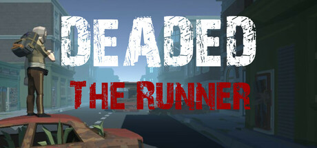
Deaded The Runner scored 68/100 on Steam Analyzer — Solid for a Action capsule. Top priority fix: [uniqueness_polish] Add a distinctive visual hook such as a stylized zombie mechanic or gameplay element callout (e.g., clear melee/ranged weapon silhouette) that communicates what makes this survival shooter unique at tiny size.

Capsule scores by dimension

  • Genre Clarity: 7/10 — Survival shooter clear at full size. The statue figure on top of the car and zombie-like setting communicate action and survival themes effectively at full header size. At tiny size, the silhouette of the figure and industrial decay backdrop remain readable, though the specific top-down shooter angle is not immediately apparent from this single image alone. Genre ambiguity slightly impacts tiny size recognition since the perspective is not obvious without gameplay context.
  • Title Readability: 7/10 — Strong contrast but stacked layout. DEADED in distressed white caps reads clearly at all sizes with good separation from the background, supported by a thick outline that holds up at tiny zoom. THE RUNNER in red below maintains decent readability at small size due to warm color contrast, though the stacked two-line layout uses vertical space inefficiently and the red may reduce contrast slightly against the dark ground at tiny size. At tiny size both lines remain legible but with minor strain on the red text.
  • Contrast & Color: 8/10 — Excellent value separation. The white distressed DEADED text pops strongly against the teal-gray industrial background and dark sky, with clear edge definition even at tiny size. The warm red THE RUNNER provides complementary color separation and draws the eye effectively. In grayscale, the bright whites and reds maintain strong value separation from the mid-tone background, creating clean silhouettes that survive the squint test well.
  • Uniqueness & Polish: 6/10 — Competent but familiar zombie theme. The distressed typography and industrial decay setting communicate a survival game competently, but the visual treatment feels fairly standard for zombie-adjacent indie titles without a distinctive art hook or mechanic callout. The statue figure adds some personality and breaks from generic zombie game clichés, but overall the composition reads as a functional genre entry rather than a memorable or premium visual identity. The craft is solid but not particularly inventive compared to top-performing action titles.
  • Brand Consistency: 6/10 — Coherent palette, limited identity markers. The teal-gray industrial palette, distressed typography style, and apocalyptic setting are internally consistent and create a recognizable mood across the capsule. However, there are no strong iconic character designs, motifs, or signature visual elements that would stand out as uniquely Deaded The Runner without additional context. The style is coherent but generic enough that it could apply to multiple survival titles in the genre.
  • Composition: 7/10 — Clear focal point, safe margins. The statue figure positioned in the upper left-center of the composition creates a strong primary focal point that draws attention immediately at all sizes. The title text is positioned lower and right, creating a two-level hierarchy that avoids competing with the figure. At tiny size the layout remains clear with no critical elements dangerously close to edges, though the vertical stacking of text leaves some unused horizontal space in the lower right quadrant.

What works

  • Distressed title typography. The white DEADED text with heavy outline and weathered style reads strongly at all scales and creates immediate visual impact against the background.
  • Strong value contrast. Bright whites and warm reds separated clearly from teal-gray midtones ensure silhouettes remain readable even at tiny thumbnail size.
  • Focal point clarity. The statue figure provides an unmistakable primary subject that directs attention and prevents the composition from feeling scattered or cluttered.

What hurts the capsule

  • Generic zombie setting. Industrial decay and apocalyptic themes are familiar across the survival genre without a distinctive visual hook that sets this title apart.
  • Limited brand identity markers. No iconic character, symbol, or signature visual element makes the capsule memorable or uniquely recognizable as Deaded The Runner specifically.
  • Inefficient text layout. The stacked two-line title arrangement wastes horizontal real estate and creates vertical stretch that could be optimized for stronger title prominence.

Priority fixes

  1. [uniqueness_polish] Add a distinctive visual hook such as a stylized zombie mechanic or gameplay element callout (e.g., clear melee/ranged weapon silhouette) that communicates what makes this survival shooter unique at tiny size.
  2. [brand_consistency] Introduce or reinforce an iconic character, weapon, or motif visible at small size that can serve as a memorable identity marker across all marketing materials.
  3. [composition] Reposition or resize the title text to use horizontal space more efficiently, reducing vertical stack height and creating better balance with the upper focal point.

Store copy priority fixes

  1. [uniqueness] Add a sentence explaining what makes this roguelike different—e.g., a specific mechanic, visual style, or combination of systems—to differentiate from Vampire Survivors and similar titles.
  2. [hook_strength] Replace 'How Far Will You Survive' with a more specific, memorable closing line that hints at the game's core appeal or biggest challenge.
  3. [feature_communication] Clarify whether progression is procedural, linear, or wave-based, and explain what 'traveling deeper' means mechanically in the gameplay loop.
  4. [audience_targeting] Add a line signaling difficulty level and expected session length (e.g., 'Quick arcade runs' or 'Hardcore roguelike challenge') to help the right player self-select.

Related guides

Steam app ID: 3505240 · Tags: Action, Post-apocalyptic, Zombies, Survival, Top-Down