Scoring genre clarity...

Confection Combat capsule

Confection Combat

Confection Combat is a PvE sugar-based Shooter. Team up with your friends to fight armies of confection-based bad guys.

$5.99
ActionCasualBattle Royale
Jonathan L ClarkFeb 21, 2025

Confection Combat scores 83/100 — better than 96% of Action capsules (n=8,534).

$5.99 · Released Feb 21, 2025 · By Jonathan L Clark

Quick text summary

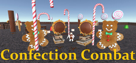
Confection Combat scored 83/100 on Steam Analyzer — Good for a Action capsule. Top priority fix: [genre_clarity] Add a subtle UI element (crosshair, weapon, or team indicator) to make the PvE cooperative shooter aspect more explicit at TINY size.

Capsule scores by dimension

  • Genre Clarity: 8/10 — Clear casual shooter with whimsy. The candy-themed environment with gingerbread characters, lollipop obstacles, and bright confectionery setting immediately signals a lighthearted, casual action game. At TINY size, the large gingerbread figures and candy props remain visually distinct enough to convey the playful shooter premise, though the exact gameplay loop is harder to parse at smallest sizes.
  • Title Readability: 9/10 — Bold, high-contrast title text. The bright yellow 'Confection Combat' text at the bottom is large, well-spaced, and maintains excellent contrast against the sky-blue and brown background. At TINY size, the title remains fully readable due to its size, weight, and color separation from the scene.
  • Contrast & Color: 9/10 — Vibrant, well-separated visual hierarchy. The capsule uses a bright blue sky, warm brown ground, vivid candy colors (red-white stripes, rich browns, mint green), and golden-yellow text that all pop distinctly against the Steam dark background. At SMALL and TINY sizes, the primary subjects (gingerbread figures and lollipops) maintain clear silhouettes and chromatic separation even in grayscale mode.
  • Uniqueness & Polish: 8/10 — Distinctive candy-themed aesthetic. The confectionery art direction is cohesive and memorable—gingerbread soldiers, lollipop candy canes, chocolate platforms, and candy props create a specific visual hook not commonly seen in action games. The craftsmanship is clean, with intentional modeling, lighting, and a unified candy-land color palette that avoids feeling template-based or generic.
  • Brand Consistency: 8/10 — Strong candy-world identity established. The capsule establishes a recognizable brand identity through consistent use of confectionery iconography (gingerbread, lollipops, sweets) and a warm, playful art style with clear lighting and modeling. This visual language aligns with the game's core concept and is distinct enough that similar capsules from other developers would not be confused with this one.
  • Composition: 8/10 — Well-balanced focal points with depth. The composition layers a clear foreground (gingerbread characters and platforms), midground (candy obstacles and props), and background (sky and structures), creating visual depth that remains readable at all sizes. The title placement at the bottom is safe from Steam cropping, and the scattered candy elements guide the eye without creating clutter or dead zones at SMALL or TINY sizes.

What works

  • High contrast title legibility. Yellow 'Confection Combat' text is large, bold, and pops clearly against the background, remaining readable even at TINY thumbnail size.
  • Memorable candy-world identity. Gingerbread soldiers, lollipop obstacles, and confectionery art direction create a distinctive, cohesive brand that stands apart from typical action game visuals.
  • Strong color separation and silhouettes. Vibrant primary colors (blue sky, brown ground, candy reds and greens) and crisp character outlines maintain clarity and visual pop against the Steam dark background.
  • Clear layered composition with depth. Foreground, midground, and background elements are well-organized, creating visual hierarchy that reads effectively even when reduced to thumbnail size.

What hurts the capsule

  • Mild visual crowding at center. Multiple lollipops, candy props, and gingerbread figures compete for attention in the middle of the image, though this does not severely harm TINY readability.
  • Gameplay mechanics not explicitly clear. While the casual action tone is evident, the capsule does not clearly communicate whether this is cooperative, competitive, or the specific shooter mechanics beyond the setting and theme.

Priority fixes

  1. [genre_clarity] Add a subtle UI element (crosshair, weapon, or team indicator) to make the PvE cooperative shooter aspect more explicit at TINY size.
  2. [composition] Consider slightly reducing the number of background lollipops to create more breathing room and emphasize the playable characters as primary focal points.

Store copy priority fixes

  1. [hook_strength] Rewrite the short description to lead with a specific, evocative hook: 'Rain candy fire on armies of marshmallows and graham cracker tanks' or 'A chaotic, colorful PvE shooter where you and up to 4 friends wield absurd confection weapons against ridiculous food enemies' — this immediately differentiates and hooks.
  2. [uniqueness] Add a closing sentence to the detailed description that articulates the specific appeal: 'Perfect for players who want co-op chaos with a candy twist' or 'Whether you're speedrunning Sugar Crash mode or perfecting your gummy bear aim on LAN, Confection Combat delivers silly, accessible shooter fun.'
  3. [feature_communication] Expand the gameplay feel in one introductory sentence before the bullet points: e.g., 'Fast-paced waves of confectionery enemies await across colorful arenas — here's what you'll encounter:' to set tone and expectation.
  4. [audience_targeting] Add a single sentence after the multiplayer description clarifying who benefits most: e.g., 'Great for party nights, couch co-op, or solo high-score chasing with friends online.'

Related guides

Steam app ID: 3506560 · Tags: Action, Casual, Battle Royale, Shooter, Arena Shooter