Hellbrella scores 80/100 — better than 93% of Gore capsules (n=827).

Quick text summary

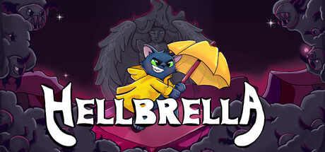
Hellbrella scored 80/100 on Steam Analyzer — Good for a Gore capsule. Top priority fix: [genre_clarity] Add a subtle UI element like a roguelite-style upgrade icon or weapon modifier symbol to reinforce the hack-and-slash mechanic hint beyond the umbrella visual alone.

Capsule scores by dimension

  • Genre Clarity: 8/10 — Playful action with clear demon theme. The cartoon cat character wielding a yellow umbrella in a demonic Hell setting immediately signals an action-adventure game with whimsical tone. At TINY size, the bright yellow umbrella and cat silhouette against the dark purple background remain readable and distinctive, clearly communicating the game's unique hook of combining cute aesthetics with chaotic demon-fighting gameplay.
  • Title Readability: 8/10 — Bold white logo stands out cleanly. HELLBRELLA uses a strong white sans-serif typeface with excellent contrast against the dark purple background. The title placement centered below the character is stable and readable at FULL, SMALL, and TINY sizes, though fine serifs and decorative character are lost at smallest scale but the wordform remains decipherable.
  • Contrast & Color: 9/10 — Excellent value separation and silhouette. The bright yellow umbrella and cat character pop dramatically against the dark purple-black gradient background, creating strong value contrast that survives the squeeze test and grayscale conversion. The white title text and pale star accents further reinforce edge clarity and visual hierarchy, making every key element read distinctly even at TINY size.
  • Uniqueness & Polish: 8/10 — Distinctive charming art style and hook. The hand-drawn cartoon aesthetic of the cat character and demon faces in the background sets this apart from generic action game templates. The core mechanic of using umbrellas in Hell is clearly telegraphed through the visual pairing, and the polish of line work, color palette, and compositional balance suggest intentional craft rather than asset-library assembly.
  • Brand Consistency: 7/10 — Consistent cartoon style, limited icon cues. The soft-edged cartoon rendering, warm-cool color palette of yellow-purple-pink, and whimsical character design are internally cohesive and appear consistent with game screenshot references. However, no strong signature symbol or motif beyond the umbrella itself is present that would anchor immediate brand recognition on repeat viewing.
  • Composition: 8/10 — Clear focal point, balanced layering. The cat-with-umbrella occupies prime center space with demon faces layered in background and foreground for depth, creating a natural visual hierarchy that guides attention immediately to the protagonist. Safe margins around the title and core character elements respect Steam cropping, and the composition maintains effective read across all viewing sizes without dead zones or competing focal points.

What works

  • Strong color contrast and silhouette. Yellow umbrella and white title create excellent value separation against dark background, maintaining clarity at TINY size and in grayscale.
  • Distinctive charming character design. Hand-drawn cat protagonist and demon aesthetic communicate both the whimsical tone and action-adventure genre clearly without generic template feel.
  • Solid title readability at all scales. White sans-serif HELLBRELLA logo maintains legibility from FULL to TINY size with clean placement and no competing visual noise.
  • Clear compositional hierarchy. Single focal point (cat with umbrella) in center with layered background demons creates depth and guides eye naturally without clutter.

What hurts the capsule

  • Limited brand identity beyond umbrella. No iconic symbol, signature palette accent, or recurring motif beyond the umbrella itself that would anchor immediate second-glance recognition.
  • Demon face details muddy at TINY scale. The background demon silhouettes lose definition and read as blurry shapes at thumbnail size, potentially weakening the Hell theme communication.

Priority fixes

  1. [genre_clarity] Add a subtle UI element like a roguelite-style upgrade icon or weapon modifier symbol to reinforce the hack-and-slash mechanic hint beyond the umbrella visual alone.
  2. [brand_consistency] Establish a signature color accent or recurring icon (e.g., stylized flame halo, umbrella badge) that appears across marketing materials to build stronger brand recall.
  3. [composition] Consider increasing demon character clarity at background layer by adjusting their outline weight or value separation to maintain visual storytelling impact at TINY size.

Store copy priority fixes

  1. [hook_strength] Amplify the umbrella-weapon concept in the short description—consider leading with 'Master 5 chaotic umbrellas in aerial combat' to emphasize the unique weapon mechanic earlier.
  2. [feature_communication] Add 1-2 sentences explaining what 'Blood Drops' and 'Pupils' do mechanically, as they are mentioned but their impact on gameplay is unclear to new players.
  3. [uniqueness] Add a comparative or distinctive statement—e.g., 'the only roguelite where your weapon IS your playstyle engine' or clarify what makes aerial umbrellas strategically different from ground-based roguelite weapons.
  4. [tone_match] Standardize capitalization in the detailed description to eliminate distracting formatting inconsistencies that undermine the intentional quirky tone.

Related guides

Steam app ID: 3510060 · Tags: Gore, Arcade, Roguelite, Demons, Replay Value