Scoring genre clarity...
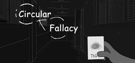
This is a game that seamlessly transitions between 2D card-based gameplay and immersive 3D environments ,"It" made everything disappear, yet the rain that night never ceased. And so, I embarked on a journey to find the answers. Why did I become myself?
$5.99Positive(41)
Card GameSurrealStory Rich
非稳态物质-Unstable MatterAug 20, 2025