Scoring genre clarity...
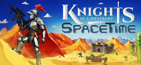
A Knight with a gun. Something's happened to time. Deadly robots invading. A twin-stick, action, top down shooter, with in depth gun customization, special abilities, and classic swords. Shoot your way through linear levels and secrets, and develop the ultimate guns and futuristic weapons.
$11.997 user reviews
ActionTop-Down ShooterSingleplayer
Destreon GamesDec 4, 2025