Take You Home scores 67/100 — better than 15% of 2D Platformer capsules (n=1,970).

Quick text summary

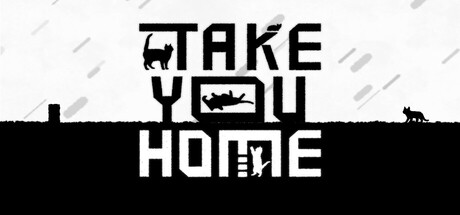
Take You Home scored 67/100 on Steam Analyzer — Solid for a 2D Platformer capsule. Top priority fix: [title_readability] Reflow title horizontally or reduce vertical stacking to maintain legibility at TINY size; consider 'TAKE YOU HOME' as a single line or two-word layout that reads faster

Capsule scores by dimension

  • Genre Clarity: 7/10 — Quirky indie puzzle adventure clear. The black cat silhouette, minimalist pixel art style, and gravity-defiant composition clearly signal an indie puzzle game with whimsical tone. At TINY size, the cat icon and geometric layout remain recognizable, though the specific mechanic (color swapping, gravity) is not visually apparent without prior knowledge. The monochrome palette with selective detail reinforces the indie puzzle aesthetic effectively.
  • Title Readability: 6/10 — Readable but stacked awkwardly. The title 'TAKE YOU HOME' is legible at full size with clean sans-serif letterforms and strong black-on-light contrast, but the vertical stacking creates an unusual rhythm that doesn't read as naturally as horizontal layout. At TINY size, the stacked blocks lose clarity and the text becomes a compressed shape rather than readable words, reducing its impact during quick scrolls.
  • Contrast & Color: 7/10 — Strong black-white separation works. The stark black horizontal band and white text create excellent value separation against the Steam dark background, with the cat silhouette reading clearly as a focal point. The grayscale treatment is intentional and maintains silhouette definition throughout all sizes, including TINY. The light rain texture in the background is subtle enough not to muddy the primary elements.
  • Uniqueness & Polish: 7/10 — Distinctive style, minimal but cohesive. The pixel art cat with a black square outline is a memorable identity marker, and the rain particle effect adds atmospheric polish without overcomplication. The design avoids generic indie clichés by committing fully to monochrome minimalism, which communicates intentionality and craft. However, the composition feels slightly static and could benefit from more dynamic visual storytelling about the core gameplay loop.
  • Brand Consistency: 7/10 — Consistent minimalist pixel identity. The capsule establishes a clear visual signature through pixel art rendering, stark monochrome palette, and the iconic black cat as a recognizable mascot. The style aligns with indie puzzle game conventions seen in top performers like COCOON and Viewfinder. Internal cohesion is strong—no stylistic contradictions—though the identity could be more distinctive if a secondary color accent or unique motif were introduced.
  • Composition: 6/10 — Centered but somewhat static layout. The title sits in the upper half with the cat and house silhouettes anchoring a strong horizontal division, creating clear foreground-background separation. At SMALL and TINY sizes, the composition reads as a recognizable geometric shape, but the centered alignment and symmetry feel safe rather than dynamic. The small car silhouette on the right edge is barely noticeable and adds little compositional weight or narrative clarity.

What works

  • Strong silhouette recognition. The black cat and house are instantly identifiable graphic elements that maintain clarity at TINY size and create immediate visual interest.
  • Excellent contrast against Steam background. The black-white value separation and stark composition pop distinctly against the dark Steam interface without relying on color saturation.
  • Cohesive minimalist style. The monochrome pixel art direction communicates premium indie sensibility and avoids generic asset fatigue common in the genre.

What hurts the capsule

  • Title stacking reduces readability at small sizes. The vertical 'TAKE YOU HOME' layout becomes a compressed unreadable block at TINY size during quick scrolls.
  • Static centered composition. The perfectly balanced symmetry feels safe and lacks dynamic visual hierarchy that guides attention or suggests gameplay excitement.
  • Underdeveloped secondary elements. The car silhouette on the right is too small and disconnected to contribute meaningfully to composition or narrative context.

Priority fixes

  1. [title_readability] Reflow title horizontally or reduce vertical stacking to maintain legibility at TINY size; consider 'TAKE YOU HOME' as a single line or two-word layout that reads faster
  2. [composition] Introduce asymmetrical balance by shifting the cat or title off-center to create visual tension and guide focal point hierarchy more dynamically
  3. [genre_clarity] Add a subtle visual cue (color tint, UI element, or pose) that hints at the core mechanic (gravity flip or color swap) without sacrificing minimalism

Store copy priority fixes

  1. [hook_strength] Replace 'mysterious black cat' with a concrete narrative or emotional payoff: e.g., 'Chase a mysterious black cat through a crumbling world to find your way home—and uncover what you've forgotten.'
  2. [uniqueness] Add a specific differentiation statement after the Key Features list, such as 'A puzzle-platformer where every mechanic—color and gravity—is weaponized equally, creating a gameplay experience unlike classic platformers.'
  3. [feature_communication] Replace 'Collect items for unexpected surprises?' with a concrete feature: e.g., 'Unlock hidden secrets and unlock alternative paths by collecting hidden items throughout the 60 levels.'
  4. [audience_targeting] Add a single explicit sentence targeting the intended audience: e.g., 'For fans of atmospheric indie puzzlers like Braid or LIMBO who crave minimalist design and tight mechanical depth.'

Related guides

Steam app ID: 3516450 · Tags: 2D Platformer, Puzzle Platformer, Hand-drawn, Indie, Cats