Quick text summary
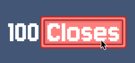
100 Closes scored 67/100 on Steam Analyzer — Solid for a Puzzle Platformer capsule. Top priority fix: [genre_clarity] Add a subtle visual cue that reinforces clicker/incremental gameplay—such as numbers, progression indicators, or multiple cursor states—to signal gameplay type at tiny size.
Capsule scores by dimension
- Genre Clarity: 5/10 — Unclear genre from visuals alone. The pixel art cursor and red button frame suggest a casual/clicker game, but the visual language is deliberately minimal and does not communicate gameplay type beyond 'something clickable.' At tiny size, the cursor pointer is the only gameplay hint, which is too vague to confidently signal clicker genre without prior knowledge of the title.
- Title Readability: 8/10 — Clear and readable at all sizes. The title '100 CLOSES' uses a bold, chunky white pixel font inside a red framed button that contrasts strongly against the blue-gray background. The text remains legible at small and tiny sizes due to large letterforms and high value contrast; the red border frame adds visual containment and helps the title pop even at 45px height.
- Contrast & Color: 8/10 — Strong separation with clear silhouettes. The white title and red button frame have excellent value contrast against the muted blue-gray background (#1b2838 equivalent), and the red border itself is warm and saturated enough to cut through quickly. At tiny size, the red button and white text remain distinct and readable; the grayscale test shows clear edge definition.
- Uniqueness & Polish: 6/10 — Competent pixel art, minimal hook. The retro pixel art aesthetic and red arcade button frame feel polished and intentional, with a clean 8-bit style that matches the casual clicker tone. However, the design does not communicate a distinctive selling point or unique mechanic beyond 'click a button'; it relies on the title itself to convey the hook rather than visual storytelling, making it feel generic within indie clicker space.
- Brand Consistency: 6/10 — Simple, consistent, lacks memorability. The pixel art style, red button, and white sans-serif font are internally coherent and would likely appear across store screenshots, creating a recognizable arcade/retro identity. However, the design has no distinctive character, motif, or iconic symbol that would make it memorable compared to peers like Balatro or Dave the Diver; the button alone is too generic a motif.
- Composition: 7/10 — Clear hierarchy, balanced layout. The composition places the red button as the dominant focal point (right of center), with the large white '100' counterbalancing on the left, creating a simple two-element layout that reads clearly at all sizes. The button frame sits well within safe margins and the layout is resilient to Steam cropping; at tiny size, both elements remain visible and distinct without clutter.
What works
- Strong title contrast and legibility. White pixel font on red button frame stands out clearly against the blue-gray background and remains readable at tiny 45px size.
- Clean, focused composition. Simple two-element layout with clear focal point avoids clutter and maintains visual hierarchy across all viewing sizes.
- Polished retro pixel aesthetic. Consistent 8-bit art style with intentional arcade button frame conveys a cohesive, craft-forward casual game identity.
What hurts the capsule
- Minimal genre communication. The cursor pointer alone is too subtle to clearly signal clicker genre at tiny size without prior title knowledge; visuals feel more like a generic UI element than a game reveal.
- Generic and unmemorable identity. The red arcade button and white text are competent but lack a distinctive character, unique color palette, or iconic symbol that would set it apart in the indie game space.
- No visual storytelling of core mechanic. The capsule does not show what '100 Closes' means or hint at gameplay progression, engagement loop, or unique selling point beyond the title text.
Priority fixes
- [genre_clarity] Add a subtle visual cue that reinforces clicker/incremental gameplay—such as numbers, progression indicators, or multiple cursor states—to signal gameplay type at tiny size.
- [uniqueness_polish] Introduce a distinctive brand element like a unique character, mascot, or signature animation (e.g., satisfying click feedback visual) to differentiate from generic button aesthetics.
- [brand_consistency] Establish and reinforce a memorable color palette or iconic motif beyond the red button that will carry across store screenshots and create visual recognition.
Store copy priority fixes
- [hook_strength] Rewrite the short description to hint at the hidden twist: something like "A deceptively simple clicker that rewards patience with unexpected depths" instead of repetitive "Click" words.
- [audience_targeting] Replace "You love boring things" with a genuine audience signal: "Perfect for fans of experimental puzzles who appreciate minimalist design and dark humor."
- [feature_communication] Add a one-sentence explanation of progression or the surprise mechanic: e.g., "But beneath the clicks lies [X], rewarding players who see past the surface."
- [genre_clarity] Explicitly mention the psychological horror or narrative element in the detailed description to justify the tag and clarify genre expectations.
Related guides
Steam app ID: 3517600 · Tags: Puzzle Platformer, Casual, Incremental, Puzzle, Point & Click