Scoring genre clarity...

Exit The Abyss capsule

Exit The Abyss

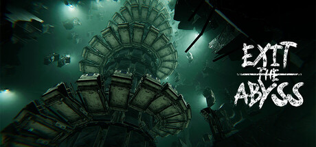
Exit the Abyss is a psychological horror game where you are trapped in an abandoned, haunted hospital. The game focuses on an oppressive atmosphere, exploration, and mysteries, with minimalist puzzle elements. Immerse yourself in a distorted reality, confront your fears, and find the way out!

Free to PlayMostly Positive(81)
MysteryAdventureExploration
Veloneer GamesMar 8, 2025

Exit The Abyss scores 72/100 — better than 49% of Mystery capsules (n=2,170).

Mostly Positive (81 reviews) · Free to Play · Released Mar 8, 2025 · By Veloneer Games

Quick text summary

Exit The Abyss scored 72/100 on Steam Analyzer — Good for a Mystery capsule. Top priority fix: [uniqueness_polish] Add a visual element that hints at the puzzle mechanic or core gameplay (e.g., distorted UI elements, door frames, clock imagery) to differentiate from generic haunted-space horror

Capsule scores by dimension

  • Genre Clarity: 8/10 — Strong horror atmosphere clearly communicated. The decaying architectural structure, sickly green-teal lighting, and distorted perspective immediately signal psychological horror and dark exploration. At tiny size, the twisted geometry and ominous environment remain readable as horror-adjacent, though the specific hospital setting becomes ambiguous. The unsettling mood is unmistakable even at 120x45 resolution.
  • Title Readability: 7/10 — Readable title with minor size issues. The white distressed font 'EXIT THE ABYSS' has strong contrast against the dark background and maintains legibility at full header size. At small and tiny sizes, the jagged letterforms remain identifiable but the distressed effect causes slight edge degradation. The title placement in the upper right avoids the busy central structure, which helps preserve readability across scales.
  • Contrast & Color: 8/10 — Excellent dark-light separation and mood. The teal-green color palette contrasts sharply against the Steam background (#1b2838), with bright architectural highlights providing clear silhouette separation from darker void areas. The lighting sources create distinct value separation that holds even at tiny size, and the overall palette feels intentional and atmospheric. Grayscale conversion maintains strong contrast hierarchy without muddy midtones.
  • Uniqueness & Polish: 7/10 — Polished aesthetic with distinctive mood. The inverted, distorted architecture conveys a unique psychological horror identity rather than generic spookiness, and the color grading feels professionally executed with consistent lighting and particle effects. The visual approach distinguishes itself from typical jump-scare horror through environmental distortion, though the core concept of 'haunted place' remains familiar within indie horror. The craft quality is clear but the core mechanic (exploration in hospital) is not visually distinct from other psychological horror games.
  • Brand Consistency: 6/10 — Competent internal cohesion, minimal brand cues. The rendering style is consistent—unified color grading, lighting treatment, and distortion effects throughout the capsule create a coherent visual experience. However, there are no distinctive character, icon, or symbol elements that would serve as memorable brand identity markers for recognition in store lists. The teal-horror aesthetic is thematically appropriate but not uniquely proprietary to Exit the Abyss.
  • Composition: 7/10 — Clear focal point with strong depth layers. The inverted spiral structure dominates the composition center-to-upper-left, creating a natural focal point that draws the eye immediately even at tiny size. Layering of lights and architectural elements creates depth, and the title placement top-right avoids competing with the structure. At small sizes, the primary subject (twisted building) remains the clear focus, though some fine detail in the background becomes noise.

What works

  • Strong atmospheric color palette. The teal-green lighting creates a distinctive mood that pops against the Steam background and communicates horror genre instantly at all sizes.
  • Clear visual hierarchy at small scale. The twisted architecture reads as a cohesive focal point even at 120x45 resolution, and the title placement avoids the busy center, maintaining readability.
  • Intentional distortion effect. The warped perspective and inverted geometry convey psychological horror and oppressive atmosphere without relying on gore or clichéd imagery.

What hurts the capsule

  • Lack of memorable brand symbols. No iconic character, motif, or visual signature exists that would allow players to recognize this game from a brand icon alone on store shelves.
  • Title distress effect reduces legibility at tiny size. While readable at full size, the jagged font degradation at 120x45 makes the text slightly harder to parse during quick scrolling.
  • Generic horror premise visually. Although the atmosphere is well-executed, the capsule does not visually communicate what makes the core mechanic (exploration and puzzle-solving) unique compared to other psychological horror games.

Priority fixes

  1. [uniqueness_polish] Add a visual element that hints at the puzzle mechanic or core gameplay (e.g., distorted UI elements, door frames, clock imagery) to differentiate from generic haunted-space horror
  2. [brand_consistency] Introduce a recurring visual motif or icon in the title treatment or corner element that could serve as a recognizable brand symbol across other marketing materials
  3. [title_readability] Consider a cleaner sans-serif variant of the title with subtle distress overlay only on select letters to improve tiny-size legibility while maintaining mood

Store copy priority fixes

  1. [feature_communication] Remove the 'Little Astronaut' promotional paragraphs from the start of the detailed description—they dilute focus and waste space that could reinforce Exit the Abyss's unique selling points.
  2. [uniqueness] Add a specific, concrete differentiator after the comp list—e.g., 'Unlike traditional walking simulators, Exit the Abyss grounds its horror in [specific mechanic/narrative element unique to this game]' to explain why it stands apart.
  3. [hook_strength] Replace 'Immerse yourself in a distorted reality, confront your fears, and find the way out!' with a more specific, gameplay-forward hook that hints at what makes the hospital's puzzle or mystery unique.

Related guides

Steam app ID: 3518110 · Tags: Mystery, Adventure, Exploration, Puzzle, Perma Death