Scoring genre clarity...

Go Forward Survivors capsule

Go Forward Survivors

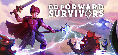
This is an exciting Survivors-like action game. Through repeated upgrades, strengthen your character and freely combine weapons, items, and gems to create a unique and powerful build. Survive the endless waves of monsters, grow stronger, and ultimately accomplish your mission to save your homeland!

$6.995 user reviews
Bullet HeavenBullet HellRoguelite
TianMingMay 6, 2026

Go Forward Survivors scores 75/100 — better than 59% of Bullet Heaven capsules (n=116).

5 user reviews · $6.99 · Released May 6, 2026 · By TianMing

Quick text summary

Go Forward Survivors scored 75/100 on Steam Analyzer — Good for a Bullet Heaven capsule. Top priority fix: [uniqueness_polish] Enhance visual distinctiveness by adding a signature UI element or particle effect unique to Survivors-like mechanics (e.g., upgrade cascades, stat glows, or build-specific iconography) to communicate the core gameplay hook.

Capsule scores by dimension

  • Genre Clarity: 8/10 — Strong action RPG signaling. The capsule clearly communicates action gameplay through the dynamic pose of the purple-armored protagonist wielding weapons and casting magic effects, supported by enemy silhouettes and magical projectiles scattered across the composition. At tiny size, the character's action stance and glowing effects remain readable, though specific Survivors-like mechanics aren't immediately obvious from visuals alone. The genre reads as action-adventure RPG confidently.
  • Title Readability: 8/10 — Clear, well-positioned title. The title 'GO FORWARD SURVIVORS' uses a bold white sans-serif font with clean outline, positioned in the upper-center region against a controlled sky background with light clouds. At small and tiny sizes, the text remains legible with good contrast and spacing. The all-caps treatment and outline styling preserve readability across all viewing conditions without collapsing.
  • Contrast & Color: 8/10 — Strong value separation and pop. The purple and magenta protagonist creates excellent contrast against the blue-pink sky gradient and darker cloud layers, while white title text pops cleanly against the softer background. The warm peachy clouds in the background contrast well with cool blues and purples of the character, maintaining silhouette clarity even at tiny size. Overall color palette uses saturation strategically to guide focus.
  • Uniqueness & Polish: 7/10 — Polished but genre-familiar. The capsule demonstrates strong execution with clean character rendering, dynamic magical effects, and intentional lighting that creates depth through the gradient sky. However, the composition feels somewhat standard for action RPG genre—protagonist-centered, surrounded by effects, with storm background elements. The craft is evident but the concept doesn't communicate a distinctive hook beyond 'magical action RPG.'
  • Brand Consistency: 7/10 — Coherent but limited signature. The purple-and-magenta color scheme is consistent and the character design appears distinctive with their ornate armor and mystical casting pose. The magical effect palette (blues, purples, white) creates internal cohesion, and the fantasy RPG aesthetic is coherent throughout. However, without access to other marketing materials, there are no clear iconic motifs or symbols that suggest strong brand recognition potential beyond the character's appearance.
  • Composition: 7/10 — Balanced focal point with minor spacing. The protagonist dominates the center-left composition with clear primary focus, supported by secondary enemy silhouettes on the right creating directional balance and depth layering. The three-layer composition (background sky, midground clouds/effects, foreground character) works well at all sizes. Minor weakness: the right edge feels slightly cramped with multiple elements, and there's a subtle imbalance between left character dominance and right enemy cluster, though this remains readable at tiny size.

What works

  • Readable title across all sizes. Bold white outlined sans-serif positioned strategically on a controlled sky background maintains legibility from full to tiny viewport without degradation.
  • Strong visual hierarchy and depth. Clear three-layer composition with protagonist foreground, effects midground, and gradient sky background creates natural eye guidance toward the main character.
  • Vibrant color contrast. Purple-magenta character against blue-pink sky gradient provides excellent value separation and pops confidently against Steam's dark background.
  • Dynamic action communication. Character's combat pose, weapon hold, and magical effect silhouettes immediately signal action-oriented gameplay at all viewing sizes.

What hurts the capsule

  • Generic action RPG composition. The centered protagonist with surrounding magic effects and storm background follows familiar genre conventions without distinctive visual storytelling that sets it apart from benchmarks like Black Myth: Wukong.
  • Right-side element crowding. Multiple enemy silhouettes cluster toward the right edge, creating visual competition with the primary character focus and slightly uneven compositional balance.
  • Limited brand signature motifs. While the purple aesthetic is coherent, there are no immediately memorable icons, symbols, or unique visual traits that would enable quick brand recognition across marketing touchpoints.

Priority fixes

  1. [uniqueness_polish] Enhance visual distinctiveness by adding a signature UI element or particle effect unique to Survivors-like mechanics (e.g., upgrade cascades, stat glows, or build-specific iconography) to communicate the core gameplay hook.
  2. [composition] Reduce right-side element clustering by repositioning one secondary enemy silhouette further back or removing it entirely to create clearer primary-to-secondary visual hierarchy.
  3. [brand_consistency] Develop a recurring visual motif (emblem, color accent, or effect signature) visible in this capsule that can anchor brand recognition across game screenshots and store assets.

Store copy priority fixes

  1. [hook_strength] Replace 'This is an exciting Survivors-like action game' with a verb-forward hook that highlights the core draw—e.g., 'Combine weapons, gems, and items into endless build combinations while surviving procedurally generated monster hordes' or lead with the specific build crafting mechanic.
  2. [uniqueness] Add 1-2 sentences explaining what differentiates Go Forward Survivors—e.g., a signature mechanic (unique gem system, exclusive weapon interaction), a narrative hook (save your homeland), or a specific design philosophy that sets it apart from other Survivors clones.
  3. [feature_communication] Expand the gem and weapon customization section with one concrete example of a synergy or playstyle outcome—e.g., 'pair fire gems with spinning weapons to create screen-clearing combos' to help players envision strategic depth.
  4. [audience_targeting] Explicitly call out accessibility features in the main copy—mention that the game features adjustable difficulty and requires no timed reflexes, immediately signaling to casual and accessibility-focused players that they are welcome.

Related guides

Steam app ID: 3519700 · Tags: Bullet Heaven, Bullet Hell, Roguelite, Roguelike, Action Roguelike