Scoring genre clarity...

Leucanthemum Eyes capsule

Leucanthemum Eyes

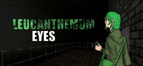
On a rainy day, Daisy decides to wait out the rain inside a tunnel. Suddenly, she found herself in a metallic, dirty and dark place, full of ghosts and a beautiful female entity. Your objective now is to find a way out of that infernal sewer as quickly as possible.

Free to PlayPositive(28)
AdventurePoint & ClickVisual Novel
KuraishimiMar 14, 2025

Leucanthemum Eyes scores 63/100 — better than 7% of Adventure capsules (n=7,922).

Positive (28 reviews) · Free to Play · Released Mar 14, 2025 · By Kuraishimi

Quick text summary

Leucanthemum Eyes scored 63/100 on Steam Analyzer — Solid for a Adventure capsule. Top priority fix: [title_readability] Consolidate or enlarge LEUCANTHEMUM text, or add a single-line logotype to maintain legibility at 120px width without kerning compression.

Capsule scores by dimension

  • Genre Clarity: 7/10 — Horror-adventure mood established clearly. The capsule clearly signals a dark, atmospheric game through the character pose, industrial tunnel setting, shadowy brick walls, and greenish lighting that evokes supernatural unease. At tiny size, the silhouette of the character and the claustrophobic environment still read as horror-adjacent action, though the exact subgenre (puzzle vs combat vs narrative-driven) remains slightly ambiguous.
  • Title Readability: 6/10 — Title legible but two-tier layout causes issues. The green "LEUCANTHEMUM" text at the top reads clearly at full size due to strong contrast and saturation, but at tiny size the letterspacing and kerning become tight and slightly difficult to parse quickly. The white "EYES" subtitle reads well, but the split layout means important branding information is spread vertically across prime real estate, and at 120px width the full title may compress awkwardly.
  • Contrast & Color: 7/10 — Good value separation, green pops strongly. The bright neon green title text and character hair stand out sharply against the dark steel and brick background, creating strong silhouette clarity even in grayscale. The character's olive coat and warm skin tones provide mid-tone contrast that prevents total flatness, and the industrial shadows add depth layering.
  • Uniqueness & Polish: 5/10 — Competent but visually conventional horror setup. The composition—lone character in a dark industrial space with neon accent—follows familiar indie horror visual tropes seen in DREDGE, Slay the Princess, and Hellblade II. The character design is clear and the color grading is intentional, but the overall scene lacks a distinctive visual hook or memorable art signature that signals a unique mechanical or narrative twist beyond standard atmospheric dread.
  • Brand Consistency: 6/10 — Consistent palette, weak identity anchors. The dark industrial setting, neon green accents, and character silhouette are internally cohesive and would likely match the game's atmosphere across store screenshots. However, there are no strong iconic motifs, recurring symbols, or signature design elements visible that would make this capsule instantly recognizable as Leucanthemum Eyes if the title were removed.
  • Composition: 7/10 — Strong focal point, balanced but slightly crowded. The character positioned right of center provides a clear primary subject and focal point that reads well at small sizes, with the tunnel recession drawing the eye inward. The title placement above and to the left creates an asymmetrical but intentional layout; however, the text-heavy top half competes slightly with the character silhouette for attention, and the mid-ground railing detail adds subtle visual noise that doesn't strongly support the hierarchy.

What works

  • Strong green-to-dark contrast. Neon green title and character hair pop distinctly against the dark industrial background, maintaining silhouette clarity at tiny sizes.
  • Clear atmospheric mood and character focus. The lone character pose, industrial setting, and shadowy lighting immediately convey a dark, isolated horror-adventure tone that matches the game's premise.
  • Intentional color grading and layering. Warm character tones against cool industrial blues and greens create visual depth and a cohesive, non-generic look.

What hurts the capsule

  • Generic horror aesthetic without standout hook. The dark tunnel, lone character, and neon lighting follow well-worn indie horror conventions without a visually distinctive or memorable signature.
  • Title legibility compromised at smallest sizes. The two-tier split layout and tight kerning of LEUCANTHEMUM become harder to parse quickly at 120px width, reducing impact during quick scrolls.
  • Weak brand identity anchors. No iconic character detail, recurring motif, or symbol that would allow recognition of the game's visual identity without the title text.

Priority fixes

  1. [title_readability] Consolidate or enlarge LEUCANTHEMUM text, or add a single-line logotype to maintain legibility at 120px width without kerning compression.
  2. [uniqueness_polish] Introduce a distinctive visual element such as a glowing entity silhouette, unique character silhouette shape, or signature graphical motif that differentiates this from standard horror game capsules.
  3. [brand_consistency] Develop a recognizable brand anchor—such as a recurring color accent, character pose variation, or iconic symbol—that ties this capsule to other game marketing materials for stronger identity recall.

Store copy priority fixes

  1. [feature_communication] Expand the gameplay section with 2-3 sentences explaining what players do in combat (e.g., 'Photograph ghosts to weaken them'), how exploration works, and what role puzzle-solving plays in the sewer escape.
  2. [hook_strength] Rewrite the closing sentence of the short description to hint at emotional or supernatural stakes beyond mere survival (e.g., 'Trapped between the living and the dead, only the mysterious entity holds the key to escape—if you can trust her.').
  3. [uniqueness] Add 1-2 sentences after the Fatal Frame reference explaining what systemic or narrative innovation Leucanthemum Eyes brings (e.g., 'Unlike traditional Fatal Frame, your choices determine which of 4 endings you reach and unlock secret lore about the sewer's tragic history.').
  4. [audience_targeting] Clarify the experience pace and target audience early (e.g., 'A story-driven supernatural adventure for players who love Japanese horror and branching narratives—expect atmospheric exploration over action sequences.').

Related guides

Steam app ID: 3519990 · Tags: Adventure, Point & Click, Visual Novel, Exploration, 2D