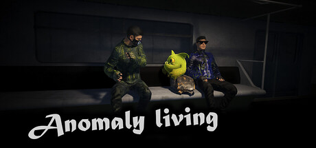
Anomaly Living scores 67/100 — better than 13% of Action capsules (n=8,534).

Quick text summary

Anomaly Living scored 67/100 on Steam Analyzer — Solid for a Action capsule. Top priority fix: [title_readability] Add a subtle text outline or increase font weight to ensure the title remains crisp and readable at TINY thumbnail size.

Capsule scores by dimension

  • Genre Clarity: 7/10 — Horror action readable at small size. The scene composition with armed characters and dark industrial setting clearly signals action-horror gameplay. A monstrous yellow entity in the center reinforces the horror and anomaly elements described. At TINY size the silhouettes and creature remain distinguishable, though specific genre details like cooperative mechanics are not visually obvious.
  • Title Readability: 7/10 — Title readable with minor weight concerns. The white script font 'Anomaly living' has decent contrast against the dark background and maintains legibility at SMALL size. At TINY size the cursive letterforms remain readable but the thin weight shows some softness. Strategic placement in the lower third avoids the busy character cluster above and provides clean background separation.
  • Contrast & Color: 7/10 — Strong value separation with warm lighting. The bright yellow creature creates immediate visual pop against the cool dark environment and Steam's dark background. Character silhouettes are well-defined with warm golden-orange side lighting that separates them from the cool-toned industrial backdrop. The grayscale read remains clear with strong value hierarchy, though midtone areas in the character cluster could be more distinct at TINY sizes.
  • Uniqueness & Polish: 6/10 — Competent horror scene with generic setup. The composition shows solid lighting and character positioning with a memorable yellow anomaly element that hints at the game's unique selling point. However, the overall aesthetic of armed characters in an industrial facility mirrors common survival-horror and co-op action games without a distinctive visual hook beyond the creature design. The execution is clean but the scene feels like a standard horror setup rather than a memorable, distinctive moment.
  • Brand Consistency: 6/10 — Coherent but not strongly iconic. The image maintains consistent dark industrial aesthetic and warm character lighting throughout, creating a cohesive visual identity. The yellow anomaly creature is potentially a recognizable brand element, but without seeing additional marketing materials, it reads more as one design choice than a signature motif. Lighting and color palette are internally consistent, though no particularly memorable brand markers are prominent at this scale.
  • Composition: 7/10 — Clear focal point with balanced layout. The yellow creature sits naturally in the visual center, drawing the eye immediately while flanked by armed characters that frame it effectively. Title placement at bottom avoids character overlap and maintains readable margins. At SMALL size the composition remains coherent with clear hierarchy, though the title could have slightly more breathing room from the bottom edge to ensure safe Steam cropping margins.

What works

  • Strong color pop with yellow creature. The bright anomaly element creates instant visual interest and differentiation against the dark cool-toned environment and Steam background.
  • Solid character silhouette clarity. Armed characters are well-lit and distinctly separated from background, reading clearly even at reduced sizes.
  • Clean title placement and contrast. White script text sits in an uncluttered region with sufficient dark background separation for readable text.

What hurts the capsule

  • Generic horror setting lacks distinction. Industrial facility with armed characters is a familiar trope in survival-horror and co-op action, offering no immediately unique visual hook beyond the creature.
  • Cursive font weight concerns at tiny scale. The thin script letterforms risk softening at very small capsule sizes, potentially reducing emergency readability.
  • Limited visual communication of cooperative mechanic. The 1-2 player co-op gameplay is not visually signaled beyond the presence of multiple characters, missing an opportunity to emphasize this unique selling point.

Priority fixes

  1. [title_readability] Add a subtle text outline or increase font weight to ensure the title remains crisp and readable at TINY thumbnail size.
  2. [uniqueness_polish] Consider adding visual elements that communicate the cooperative nature or the 'find Leia' objective to make the capsule more emotionally distinct from generic horror games.
  3. [composition] Ensure title has at least 10-15px safe margin from bottom edge to protect against Steam cropping on various device aspect ratios.

Store copy priority fixes

  1. [hook_strength] Rewrite the short description closing to replace 'Good luck!' with a specific threat or high-stakes consequence (e.g., 'but time is running out and something is hunting in the dark').
  2. [uniqueness] Add 1-2 sentences explaining what makes the anomalies unique to this world—visual or mechanical differentiation from standard horror tropes.
  3. [feature_communication] Expand the detailed description to include explicit explanation of hidden object hunting and inventory management—what do these systems feel like in practice?
  4. [genre_clarity] Add a single sentence defining what anomaly phenomena are and how they shape the core gameplay loop beyond just being flavor.

Related guides

Steam app ID: 3524700 · Tags: Action, Co-op Campaign, Co-op, Horror, Adventure