Scoring genre clarity...
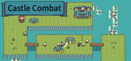
RTS, but the soldiers will act automatically: Each soldier has different characteristics/attribute values/action methods. Choose the appropriate soldiers and buildings according to the battlefield situation, and destroy the opponent's castle only through your strategy rather than operation!
$2.994 user reviews
RTSStrategyCute
Pixel Fox GamesMar 30, 2025