Scoring genre clarity...

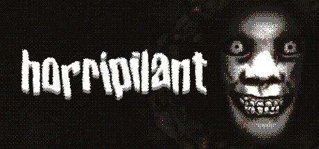
Horripilant capsule

Horripilant

KILL YOUR GOD. BECOME WORTHY. Horripilant is a chilling idle incremental dungeon crawl through the horrors of a forgotten underworld.

$5.59Very Positive(363)
IncrementalIdlerPixel Graphics
Alexandre Declos , Pas Game StudioFeb 20, 2026

Horripilant scores 72/100 — better than 38% of Incremental capsules (n=1,374).

Very Positive (363 reviews) · $5.59 · Released Feb 20, 2026 · By Alexandre Declos

Quick text summary

Horripilant scored 72/100 on Steam Analyzer — Good for a Incremental capsule. Top priority fix: [genre_clarity] Add a subtle UI or progression indicator (counter, bar, resource icon) to signal idle-incremental mechanics without compromising the horror aesthetic.

Capsule scores by dimension

  • Genre Clarity: 7/10 — Dark horror idle game clearly signaled. The pixelated demonic face with glowing eyes and menacing grin immediately communicates horror and supernatural themes, aligning well with the dark dungeon-crawl concept. At TINY size the skull-like visage and eerie expression remain readable and genre-appropriate, though the 'idle incremental' mechanic is not visually obvious—this is a minor gap since horror-RPG is correctly conveyed.
  • Title Readability: 8/10 — Bold white typography reads at all sizes. The title 'horripilant' uses a strong white pixelated font on a dark background with good letter spacing and high contrast that holds at SMALL and TINY sizes. The weight and placement on the left side above a quieter background region ensures the name remains legible even under quick scroll and slight blur, with no distracting decoration that would collapse letterforms.
  • Contrast & Color: 8/10 — High-value separation with strong silhouette. Bright white title and pale pixelated face stand in sharp contrast against the near-black background (#1b2838), creating excellent value separation that survives the grayscale test. The glowing eye highlights and mouth create additional focal points of brightness, and the overall composition maintains clear silhouette definition even at TINY size without muddy mid-tones.
  • Uniqueness & Polish: 7/10 — Distinctive pixel-art horror aesthetic. The retro pixelated demon face with a grin conveys a specific horror-game DNA rather than a generic dungeon scene, and the intentional low-res style suggests a deliberate artistic choice reminiscent of classic horror games. The craft feels cohesive and intentional, though without seeing store screenshots the uniqueness versus competitor capsules is moderate—it is recognizably a horror idle game but not yet iconic.
  • Brand Consistency: 6/10 — Coherent pixel-horror style, limited identity signals. The pixelated art style and dark palette are internally consistent and suggest a recognizable visual identity for a retro-styled horror title. However, without a distinctive character, symbol, or signature color beyond generic 'dark and pale,' the capsule lacks a memorable brand hook that would stand out in future marketing or as a franchise identity anchor.
  • Composition: 7/10 — Clear focal point with balanced layout. The demonic face anchors the right side as a strong primary subject while the title on the left provides counter-balance, creating a stable composition that reads clearly at SMALL and TINY sizes. The title and face are well-separated and do not compete; however, there is a slight dead-space void in the center-right that could be tightened, and the face crops close to the right edge which risks trimming detail on some displays.

What works

  • Excellent title contrast and legibility. White pixelated text maintains full readability at all sizes and integrates naturally without decorative noise or collapsing letterforms.
  • Strong genre signaling through horror imagery. The glowing-eyed demon face instantly communicates dark supernatural horror and differentiates the title from generic RPG presentations.
  • High value separation from background. Bright foreground elements pop sharply against the near-black field, ensuring the capsule commands attention during fast scrolls and survives grayscale contrast tests.

What hurts the capsule

  • Idle incremental mechanic not visually communicated. The capsule reads as pure horror-RPG but gives no visual hint of the idle/incremental gameplay layer, which is core to the game's pitch.
  • Limited brand identity beyond style. The pixel-art aesthetic is cohesive but generic within retro-horror space; no distinctive character, symbol, or signature palette element emerges that would be memorable or franchisable.
  • Composition has minor dead-space waste. The center-right area is somewhat sparse, and the demon face crops very close to the right edge, risking loss of detail if the image is cropped or resized on certain Steam displays.

Priority fixes

  1. [genre_clarity] Add a subtle UI or progression indicator (counter, bar, resource icon) to signal idle-incremental mechanics without compromising the horror aesthetic.
  2. [composition] Shift the face slightly left and add a secondary visual element (e.g., dungeon tier indicator, altar symbol) to fill center-right void and reduce edge-crop risk.
  3. [brand_consistency] Introduce a signature motif (e.g., a recurring symbol, color accent, or iconic item) that links to the store screenshots and creates a memorable visual anchor for the Horripilant brand.

Store copy priority fixes

  1. [uniqueness] Add a specific differentiator such as 'Unlike traditional idle dungeon crawlers, Horripilant weaves narrative puzzle-solving into every stage, forcing meaningful decisions rather than passive clicking' or explain what makes the god-slaying journey mechanically or narratively distinct.
  2. [feature_communication] Expand the feature bullets to show interconnection: replace 'Solve puzzles and explore the depths of your camp' with concrete examples like 'Solve environmental puzzles that unlock new zones and grant rare resources' or 'Upgrade gear with materials earned through puzzles and combat.'
  3. [hook_strength] Strengthen the opening lines of the detailed description by leading with a verb: change 'Horripilant is a chilling incremental dungeon crawl...' to 'Click, think, and descend: Horripilant blends idle progression with puzzle-solving in a forsaken dungeon where every step brings you closer to confronting your god.'
  4. [audience_targeting] Clarify session design early in the detailed description: add a sentence such as 'Play idle for minutes or hours—Horripilant respects your pace, rewarding both active puzzle-solvers and passive grinders.'

Related guides

Steam app ID: 3525970 · Tags: Incremental, Idler, Pixel Graphics, Casual, Horror