Scoring genre clarity...

PEAK capsule

PEAK

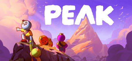
PEAK is a co-op climbing game where the slightest mistake can spell your doom. Either solo or as a group of lost nature scouts, your only hope of rescue from a mysterious island is to scale the mountain at its center. Do you have what it takes to reach the PEAK?

$4.95Overwhelmingly Positive(7,272)
MultiplayerOnline Co-OpCo-op
Team PEAKJun 16, 2025

PEAK scores 78/100 — better than 78% of Multiplayer capsules (n=2,948).

Overwhelmingly Positive (7,272 reviews) · $4.95 · Released Jun 16, 2025 · By Team PEAK

Quick text summary

PEAK scored 78/100 on Steam Analyzer — Good for a Multiplayer capsule. Top priority fix: [genre_clarity] Add a subtle visual cue such as a rope connecting the characters or climbing gear detail to reinforce the climbing mechanic at small sizes without cluttering the composition.

Capsule scores by dimension

  • Genre Clarity: 7/10 — Co-op adventure climbing implied. The image shows a group of small, rounded cartoon characters perched on a rocky ledge looking up at a dramatic mountain peak, which effectively communicates a co-op climbing adventure. The cheerful, slightly chaotic character poses suggest cooperative gameplay and light-hearted tone. At tiny size the mountain silhouette and group of characters still read as an outdoor adventure, though the specific climbing genre cue is subtle.
  • Title Readability: 9/10 — Bold chunky title reads clearly. The title PEAK is rendered in large, chunky hand-painted white letters with strong contrast against the warm purple-orange sky, placed prominently in the upper center area. At small size the four-letter word remains fully legible due to the generous letter sizing and clean spacing. At tiny size the title is still readable as the short word count and thick letterforms hold up well.
  • Contrast & Color: 8/10 — Warm palette pops on dark background. The warm orange and purple gradient sky creates strong value separation against Steam's dark #1b2838 background, especially along the bottom silhouette of the rocky ledge. The characters use saturated warm tones that stand out from the cooler background mountain. At tiny size the overall warm-versus-cool contrast keeps the image legible, though the darker purple mountain in the mid-ground blends somewhat with the sky at very small scales.
  • Uniqueness & Polish: 7/10 — Charming indie style, distinct cast. The chunky hand-drawn art style and cast of quirky nature-scout characters give this capsule a distinctive, approachable personality that stands apart from generic indie capsules. The painted title treatment feels intentional and cohesive with the illustration style. Compared to top-genre benchmarks it lacks the cinematic impact of something like DAVE THE DIVER or Hades II, but its warmth and playfulness are a genuine selling point.
  • Brand Consistency: 8/10 — Cohesive hand-painted identity. The soft, painterly illustration style, warm earth-and-sky palette, and chunky character designs form a recognizable visual identity that would carry across screenshots. The hand-lettered title font matches the rough, illustrated aesthetic of the characters and environment seamlessly. The overall look feels deliberate and would be recognizable across the store page without feeling copied from another title.
  • Composition: 8/10 — Clear foreground group with mountain focus. The composition uses a strong foreground-to-background depth layering: characters on the ledge in the lower-left foreground, the dramatic mountain peak rising centrally to the right midground, and an open sky behind. The title sits in the upper center over clear sky, keeping it uncluttered. At small size the character cluster and mountain relationship reads well, though at tiny size the individual characters merge into a single colorful blob, which still reads as a group.

What works

  • Short, punchy title. Four large letters in a painted style remain readable down to tiny thumbnail sizes, making PEAK one of the most legible title treatments in its peer group.
  • Warm palette contrast. The orange-purple sky gradient creates immediate contrast against Steam's dark storefront background, ensuring the capsule draws the eye during quick scrolling.
  • Charming character group. The cluster of rounded, colorful scout characters instantly signals co-op play and friendly tone, differentiating it from more serious adventure titles.
  • Clear depth layering. Foreground ledge, midground mountain, and open sky create a strong three-plane composition that holds structural clarity even at reduced sizes.

What hurts the capsule

  • Genre specificity weak at tiny size. The climbing genre is implied but not explicit; at tiny size the characters and mountain could read as a generic outdoor adventure rather than a co-op climbing game specifically.
  • Characters merge at smallest sizes. The individual character designs, which are a key charm and brand element, collapse into an indistinct colorful blob at 120x45 thumbnail size.
  • Mountain blends with sky mid-ground. The purple-toned mountain peak has limited value contrast against the similarly toned sky, reducing silhouette clarity at small and tiny sizes in grayscale.
  • No co-op or gameplay cue text. There is no tagline, badge, or secondary visual cue reinforcing the co-op climbing hook, meaning the genre pitch relies entirely on the illustration reading correctly.

Priority fixes

  1. [genre_clarity] Add a subtle visual cue such as a rope connecting the characters or climbing gear detail to reinforce the climbing mechanic at small sizes without cluttering the composition.
  2. [contrast_color] Increase the value contrast between the central mountain silhouette and the sky behind it with a stronger rim light or darker mountain tone so it reads clearly in grayscale and at tiny size.
  3. [composition] Slightly enlarge or brighten the character group so they retain individual color identity rather than merging into a blob at 120x45 thumbnail size.
  4. [uniqueness_polish] Consider adding a small co-op badge or short tagline in a style matching the hand-painted aesthetic to communicate the multiplayer hook to browsers who do not read the description.

Store copy priority fixes

  1. [feature_communication] Replace the repeated short description opening in the detailed section with a sentence explaining what the daily rotation mechanic specifically changes (e.g., 'The mountain's layout, hazards, and resource locations shift daily, forcing climbers to adapt strategies and return for fresh challenges').
  2. [uniqueness] Add a 1-2 sentence differentiator that explains what makes PEAK's climbing mechanics or co-op system distinct (e.g., how physics-based climbing differs from typical platformers, or what makes rope-placement cooperation a core selling point).
  3. [feature_communication] Clarify the survival gameplay loop in 'SURVIVE' section by specifying how injury management and stamina directly impact climbing ability (e.g., 'Taking damage reduces stamina, forcing you to choose between pushing forward or retreating to rest and scavenge').
  4. [feature_communication] Move or expand vague flavor items ('questionable foods,' 'ghosts') into brief mechanical explanations so players understand their functional purpose beyond cosmetic charm.

Related guides

Steam app ID: 3527290 · Tags: Multiplayer, Online Co-Op, Co-op, Physics, Adventure