Scoring genre clarity...

How 2 Escape: Lost Submarine capsule

How 2 Escape: Lost Submarine

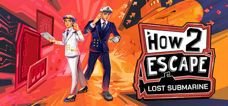
Team up with a friend to reach a lost submarine and prevent the outbreak of war. Work together on two devices to solve increasingly challenging puzzles, where each of you has your own unique role to play. 2 players: 1 buys the game, the other uses the free Companion App

$7.79Very Positive(147)
PuzzleCo-op CampaignCasual
Breakfirst GamesJun 24, 2025

How 2 Escape: Lost Submarine scores 73/100 — better than 58% of Puzzle capsules (n=4,408).

Very Positive (147 reviews) · $7.79 · Released Jun 24, 2025 · By Breakfirst Games

Quick text summary

How 2 Escape: Lost Submarine scored 73/100 on Steam Analyzer — Good for a Puzzle capsule. Top priority fix: [title_readability] Increase 'LOST SUBMARINE' subtitle size or contrast to maintain readability at tiny thumbnail scale, or simplify subtitle to single iconic word.

Capsule scores by dimension

  • Genre Clarity: 7/10 — Cooperative puzzle adventure readable. The two characters in contrasting uniforms (captain and scientist) clearly signal a cooperative team dynamic, while the submarine silhouette and industrial setting establish an adventure/escape theme. At tiny size, the character poses and dual protagonist setup read as cooperative gameplay, though the exact 'escape room' mechanic is not immediately obvious without reading the title.
  • Title Readability: 8/10 — Bold logo stands firm at scale. The 'HOW 2 ESCAPE' logo uses thick white lettering with a black outline on a contained badge shape, ensuring strong legibility at all sizes including tiny thumbnails. The 'LOST SUBMARINE' subtitle below is smaller but readable at small size; at tiny size it becomes difficult but the main logo remains clear and iconic.
  • Contrast & Color: 8/10 — Vibrant warm palette pops cleanly. The warm red-to-orange gradient background creates strong value separation against the Steam dark background (#1b2838), and the white-suited character and orange geometric elements read with excellent silhouette clarity. The color scheme maintains saturation control without muddy mid-tones, and the white badge for the logo pops distinctly even at tiny size.
  • Uniqueness & Polish: 7/10 — Polished illustration with cohesive style. The art direction shows intentional character design with two distinctly dressed protagonists, clean geometric orange shapes suggesting submarine/industrial elements, and a consistent illustrated aesthetic. While the cooperative dual-character hook is distinctive, the execution feels competent rather than exceptionally memorable compared to top-tier genre peers like DREDGE or Chants of Sennaar.
  • Brand Consistency: 6/10 — Functional consistency without strong motif. The capsule uses a cohesive warm color palette and illustrated character style that should align with store screenshots, and the captain/scientist duo likely serves as a recognizable identity pairing. However, there are no obvious iconic symbols, signature visual quirks, or memorable brand-specific elements that would make this capsule instantly recognizable on future marketing materials.
  • Composition: 8/10 — Strong focal hierarchy with clear depth. The two characters occupy the left-center with strong visual weight, the logo badge anchors the right side creating balance, and orange geometric shapes in the background provide layered depth without clutter. At small and tiny sizes, the character duo reads as the primary subject while the logo maintains anchor clarity; safe margins are respected and the composition remains resilient to Steam cropping.

What works

  • Logo durability across scales. The thick-outlined white 'HOW 2 ESCAPE' badge remains legible and iconic even at tiny thumbnail size, creating immediate brand recognition.
  • Color contrast against dark background. The warm red-orange palette creates strong silhouette separation and vibrant pop against Steam's dark theme, enhancing discoverability in browsing.
  • Cooperative gameplay visual communication. The two distinctly dressed characters in complementary poses clearly signal teamwork and dual-role mechanics without text explanation.

What hurts the capsule

  • Generic cooperative adventure feel. While well-executed, the scene lacks a distinctive hook or unique visual mechanic that differentiates it from other cooperative puzzle games in the genre.
  • Subtitle legibility at tiny size. The 'LOST SUBMARINE' text becomes difficult to read at thumbnail scale, reducing clarity of the specific adventure setting for quick-scroll discovery.
  • Limited memorable identity signals. No iconic mascot, signature symbol, or visual motif that would make this capsule instantly recognizable beyond the generic dual-character setup.

Priority fixes

  1. [title_readability] Increase 'LOST SUBMARINE' subtitle size or contrast to maintain readability at tiny thumbnail scale, or simplify subtitle to single iconic word.
  2. [uniqueness_polish] Add a distinctive visual element (submarine detail, gear motif, or environment feature) that creates a unique visual hook beyond the two-character composition.
  3. [brand_consistency] Develop a repeatable visual signature or color accent that appears consistently across store screenshots and marketing to build instant recognition.

Store copy priority fixes

  1. [hook_strength] Rewrite the opening to lead with the unique gameplay mechanic: 'Solve co-op puzzles on two separate devices—one player explores the submarine, the other gathers clues via a free companion app. Only one copy needed.' This front-loads differentiation and value.
  2. [feature_communication] Expand the companion app section with a concrete example: describe one specific puzzle scenario showing how the app player discovers a clue and shares it with the main player, making the mechanic tangible.
  3. [tone_match] Reduce narrative exposition in the 'SAVE THE WORLD' section and replace one-third of it with a brief sentence anchoring the tone as 'lighthearted co-op adventure' rather than military thriller, clarifying the casual intent.
  4. [uniqueness] Add a sentence explicitly contrasting this format to other co-op games: 'Unlike traditional split-screen or hot-seat games, each player has a completely different interface and role—designed to keep communication constant and puzzles collaborative.'

Related guides

Steam app ID: 3530680 · Tags: Puzzle, Co-op Campaign, Casual, Board Game, Team-Based