Scoring genre clarity...
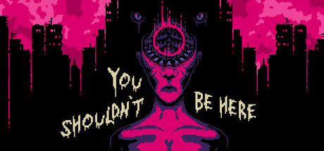
This short psychedelic visual novel takes place in a strange world inhabited by harrowing creatures shunned by the light. You’ll meet someone who has made this world their own, and in doing so, learn the reason why you shouldn't be there.
$0.77Very Positive(10)
Visual NovelPsychological HorrorText-Based
Doomster EntertainmentJul 1, 2025