Scoring genre clarity...
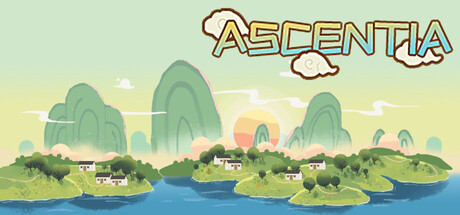
This is an adventure through a landscape of mountains and waters. Amidst peaks and brooks, craft your legend. Traverse crags, cut through forests, explore ruins. Face strong foes, crack mechanisms, gather treasures. The path awaits!
$1.99
Side ScrollerChoose Your Own AdventureExploration
杏果apricotMar 6, 2025